HOME | DD
 DHLarson — Ms. Pac-Man Logos 01

Published: 2013-01-29 18:07:08 +0000 UTC; Views: 2920; Favourites: 5; Downloads: 62
Redirect to original
Description
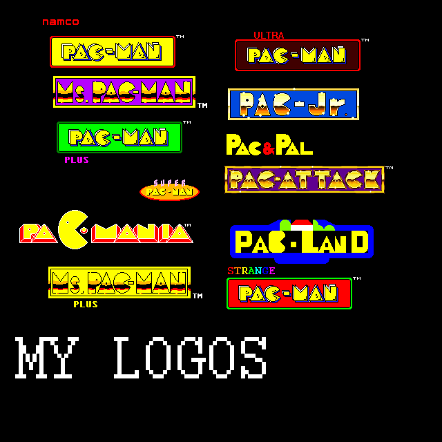
The Ms. Pac-Man logo is a lot simpler then the Pac-Man logo I did last week. The top one has the correct width of the “shine” line or reflect effect lines. The middle one is more of an OCD observation oh what the lines had a bigger width. The bottom is just the removal of the lines all together.Disclaimer
I did not design this logo. I’m NOT claiming I designed this logo. I do NOT own the trademark for this logo. All I did was reproduce the logo in Adobe Illustrator as a study in logo design.
You may use this image on your own fan site, fan art and blog articles.
If you do use it post a link in the comments so other can see your work. At the vary least send me a note so I can what you have done with it.
Related content


Comments: 1

Could you please help me and design a modified version of that logo with an "H" in the middle (in place of the dash) so it reads Ms. Pachman?
👍: 0 ⏩: 0