HOME | DD
 dierat — Lockstock study
Published: 2009-07-08 19:50:20 +0000 UTC; Views: 4790; Favourites: 101; Downloads: 0
Redirect to original
Description
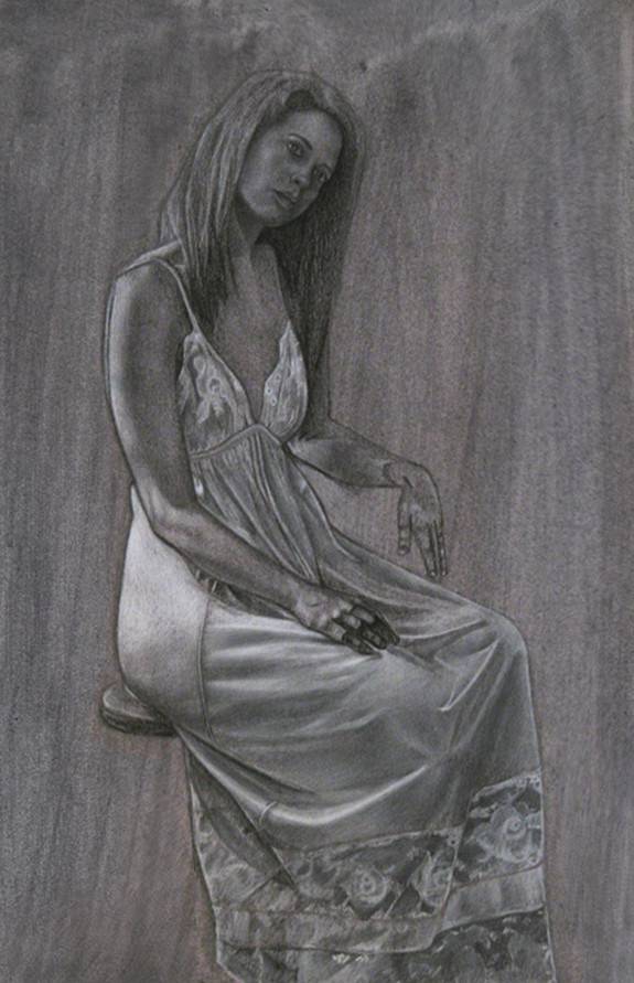
This is a study of value and fabric folds from one of 's excellent photographs. This is actually a progress shot; when I finished the drawing I sprayed it with artist's fixative and the moisture dissolved a lot of the white charcoal, so this is the best shot I have of it.White and black charcoal pencils on watercolor paper toned with a black acrylic wash.
Stock:
lockstock.deviantart.com/art/W…
You can download the paper texture (without the drawing) here:
fav.me/d2w5xuk
Related content


Comments: 104
 (Smile)")


I've used her stock before, excellent jobby
👍: 0 ⏩: 1

Yeah, her stock's awesome; I love it ")
👍: 0 ⏩: 0

I can really feel the fabric, it's very well-done.
👍: 0 ⏩: 0

apart from the fact she kinda blends into the background i really love this. you draw so good

👍: 0 ⏩: 0

wow! is amaizing...you are a greate whit pencil
👍: 0 ⏩: 0


 (Wink)")


lovely work! some fantastic details and tonal changes. the shadows and folds in the dress look amazingly realistic. well done!
👍: 0 ⏩: 1


")


A very nice study! I assume her hand was resting on something before as it is eeriely hanging there now. You've captured the highlights and shadows very well, especailly on the dress, you have a good eye for detail. I think you could have possibly made the hair to look more soft as it appears slightly rigid. Maybe use a different tone for the background next time or darken it up?
👍: 0 ⏩: 1
Very good points, thanks for sharing ^^ I definitely agree about the tone; she doesn't stand out much against the mid-tone background. And yeah, her hand was supported by the arm of the chair, which was not included in this study. Thanks for the comment!
👍: 0 ⏩: 1

wow ! you did a well good job on the dress !
👍: 0 ⏩: 0

oh, this is really interesting, this drawing really looked like a real person from far or in other words, from the smller view x3
👍: 0 ⏩: 0

Whoa... that's pretty realistic! Strange pose her arm has goin on there though.. 
👍: 0 ⏩: 1
Oh yeah, it's resting on the arm of the chair, which isn't in the drawing ^^ Thanks for the comment
👍: 0 ⏩: 1
lol That would make a lot of sense!
👍: 0 ⏩: 0

Wow, the fabric of her dress looks really realistic, nice job. I wouldn't change a thing about that. However, I'd like to add that I know it wasn't your area of focus, but the background causes her to look washed-out. I guess you already sprayed it with fixative, but in your next piece, I'd think about adding some more contrast to make your figure pop out. For example, you could shade very dark around her and then fade it out and she would stand out a lot more.
👍: 0 ⏩: 1
That's a really good point. I think what I should've done is just toned the paper darker with another layer of wash. That would help the figure pop since it is predominately white. Thanks for the suggestion ^^
👍: 0 ⏩: 0

Wowza you've got a really talent here.
the image is really stunning and lovely.
Great expression.
My only advice would be when your doing a wash to take the brush right to the edge of the paper so you end up with nice neater lines and no sort of curvy bits that you get up the top.
But you ma like it that way it is <3
👍: 0 ⏩: 1
Thanks, I'll try to make the edges more consistent in terms of tone in the future ^^
👍: 0 ⏩: 1

What the hell? You post an awesome, seemingly flawless drawing then ask for critique? How am I supposed to find flaw with this, its gorgeous. Not fair, D.
Okay I got one: it can't make me breakfast.
👍: 0 ⏩: 1
Yeah I tried vacuuming the house with it and that didn't turn out too well either. :sigh: Back to the drawing board!
👍: 0 ⏩: 0

That's amazing. I've always been deeply impressed with proper drawings of folding fabric.
👍: 0 ⏩: 1
Yeah that's the thing about fabric folds. If you can get it to work, it can sell the image on its own, but if it looks bad, it's really obvious. So I'm trying to do some studies to help my understanding of it, as seen here. Thanks for the comment ^^ Are you still in Portugal?
👍: 0 ⏩: 1
Well, I think this turned out pretty well.
Yes, the Summer school in Braga just finished. Tomorrow I'm taking the train down to Coimba and then on Wednesday I'm going to Lisbon. I'm pretty excited.
👍: 0 ⏩: 0

This looks great, love the folds in the fabric. What size paper did you use? I never could get the hang of charcoal, I always ended up smearing it all over the place.
👍: 0 ⏩: 1
It's about 9x13". This was done with hard charcoal pencils, so less smearing and more drawing. It's actually a lot like soft graphite or colored pencils. But the way I use it's a lot like colored pencils because I would layer the white over the black charcoal to smooth and blend it. You should try it!
👍: 0 ⏩: 1
I think I would probably have fun if I tried it in an art class, but when I'm doing my own stuff I always get so caught up in details and wanting stuff to be perfect, too much so that it's hard for me to break into new media. In art class though I'm the perfect student, I just happily mess around and try to use whatever technique or instruction I'm given cause I don't really care if my bowl of fruit looks like crap or not, it's a bowl of fruit!
👍: 0 ⏩: 1
I think that's something a lot of artists deal with. I think it helps to tell yourself from the beginning that "this is just a study" so you're not expecting it to be your next masterpiece. And then if it turns out well, cool. If not, oh well, next piece.
👍: 0 ⏩: 1
Yeah if you're not going to experiment in art class then where? I keep telling this to the girl that works next to me. She keeps getting frustrated with her painting but then at the same time refuses to mess with it saying she doesn't want to make it any worse than it already is! Even though that sounds like complete nonsense to me. Art is such a subjective thing too, I would thing that any good art teacher wouldn't judge you so much on results but rather on effort and your willingness to try new things.
👍: 0 ⏩: 1
I know when I was in college, it was really hard to branch out and try new things because you were always trying to push out "portfolio level" work. Which now seems so silly because I never show anyone my college work. Also, the thing I find strangest is in the 2 years after I graduated, I learned more from working on my own than I did in school because I can work on whatever I feel I need to work on and take as much time on it as I want. I wish art school programs were more about learning and less on results.
👍: 0 ⏩: 0


Very good work, i do like the way how lights and shadows play here
👍: 0 ⏩: 1
Thanks, and thanks for the fave!

👍: 0 ⏩: 0

That looks marvelous! Great job on the lace and fabric. This rocks!
👍: 0 ⏩: 1
| Next =>