HOME | DD
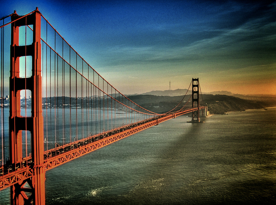
 differen-and-proud — 'But mommy that bridge is red'

Published: 2010-07-24 09:35:28 +0000 UTC; Views: 4019; Favourites: 69; Downloads: 0
Redirect to original
Description
I'm not sure how I feel about this picture.The editing was completely out of my comfort zone but I thought I'd give it a goreally really mixed feelings on this piece.i wanted to try something different but i'm not sure if i like it.
i'd love any critiques or opinions people have to offer!
Related content


Comments: 72

What a fantastic perspective, I think the pp looks good,
👍: 0 ⏩: 0

Hey i really like this...the edting adds a nice touch can u check out my editing tell me what you think and watch if u think im good enough
👍: 0 ⏩: 0

that bridge is beautiful! The cars look so tiny °°
👍: 0 ⏩: 0

Nothing is wrong with trying, that's how you learn and get better.
You can still revisit this picture in the future and do a different kind of post-processing, if you decide to.
Good luck!
👍: 0 ⏩: 0

nice view but...
somethings wrong with sky, nad hallo effect around bridge...
👍: 0 ⏩: 0


This does look really nice! The only part I would point out is the lighter areas along the top. Overall, it's a really beautiful composition! I love the clouds and the bright red coloring.
👍: 0 ⏩: 0


the contrast is nice but the lighter areas around the pylons are a little bitt irritating
👍: 0 ⏩: 0

I'd have to say the contrast is nice, and the composition is pretty good overall.
👍: 0 ⏩: 1

awww thank you  (Smile)")
👍: 0 ⏩: 1
You're welcome
")
👍: 0 ⏩: 0

Awesome shot in my opinion but some softening on the clouds would maybe remove those unwanted (?) color change lines
👍: 0 ⏩: 0


Trying something different is actually the definition of originality. Nice job and all the best in your future work
👍: 0 ⏩: 1
thank you so much!
👍: 0 ⏩: 0

that is just... wow
the contrast is beautiful *two thumbs up*
👍: 0 ⏩: 1
<= Prev |