HOME | DD
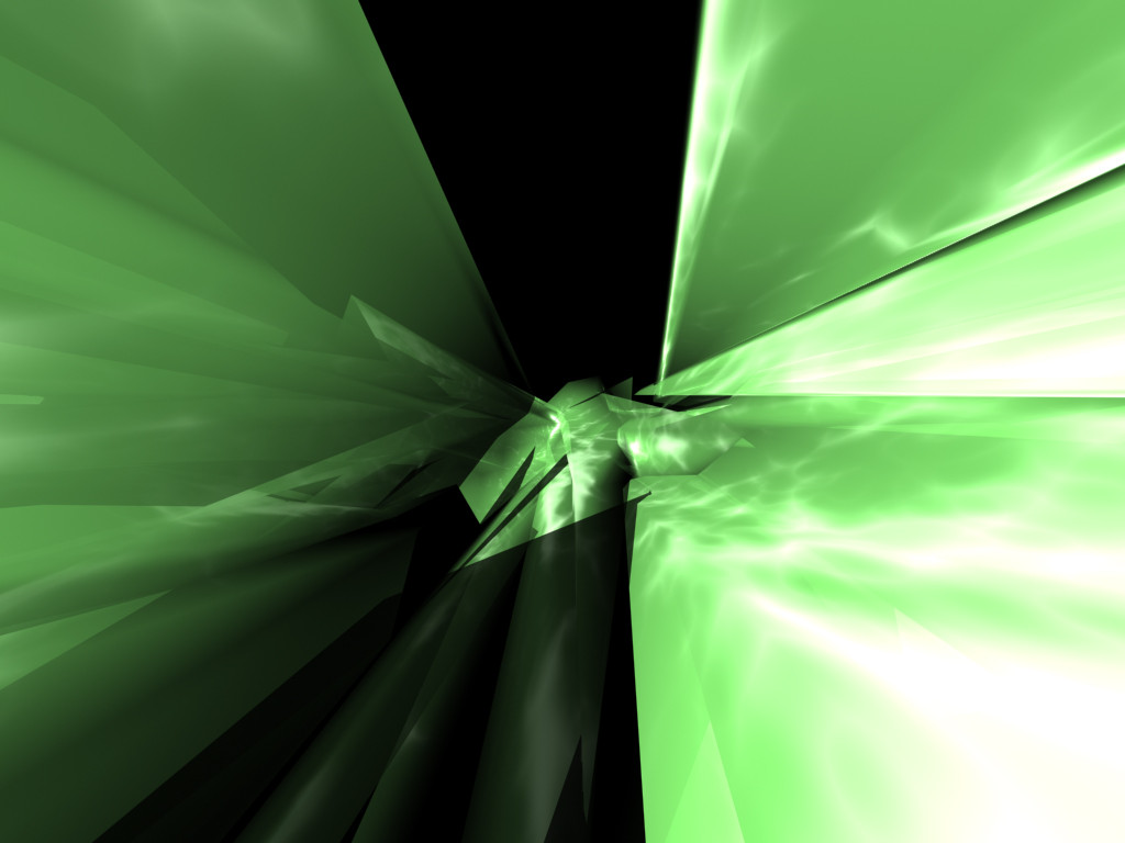
 digital — Relay Defective v1

Published: 2002-01-18 02:33:10 +0000 UTC; Views: 810; Favourites: 4; Downloads: 258
Redirect to original
Description
Total time: 2 1/2 hours.If you ask me, time relatively well spent...
Something sort of new for me.
Experimenting.... I think it might look better with
blue as a base, and I may screw with the color
curve, but this is version 1.
And so comes the time to ask...
Like the end result?
-Digital
DE-viate.
Related content


Comments: 8

reminds me of the game decent - my new backgrounds screen thanks!
if i ever become a cyborg, i hope you make the interface
👍: 0 ⏩: 0

I like green
Eyes Of Jade : http://members.tripod.com/michael_evelyn
👍: 0 ⏩: 0

i dig it too. its does, as wseid pointed out, also remind a bit of the xbox emblem...
but i like green so no complaints here :]
👍: 0 ⏩: 0

I dig it. Very nice.
------------------------------
Pro-Deviant
Failure is only a teaching point for the future. Determination.
👍: 0 ⏩: 0

well I like it. thinking xbox.
mayeb a coloration of blue or orange?
I also like the font
👍: 0 ⏩: 0

k3k3k3, when I first saw this I immediately thought of the X-BOX green X symbol. Good or bad, I have no clue. The layout of the image is creative and eye catching, along with the colors and light. Only problem I see is that maybe you might want to touch up the text and some of the boxes, which at some parts look a bit too blurred, and not fitting for the right half.
-amphex(dan)
👍: 0 ⏩: 0

Interesting, very "l33t". yes some new color would be cool, green is blah
👍: 0 ⏩: 0

very different, I like the balance and coloring... very cool detail
Fat asstronauts for ever...
Irie Vibes to all...
👍: 0 ⏩: 0