HOME | DD
 digitalshock — Exp.

Published: 2005-08-11 17:24:07 +0000 UTC; Views: 466; Favourites: 16; Downloads: 240
Redirect to original
Description
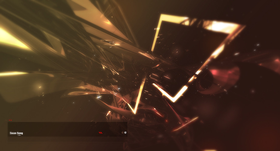
This absolutely sucks, but hey i wanted to give a heads up.Related content


Comments: 26

i spent some good time looking at this.... i don't usually do that....
i won't pretend to be an expert in vector/line art.... but i can say you really have design sense.
i tend to be amazed by simple things.....

👍: 0 ⏩: 0


Your work is incredible, man
I like this one big time
👍: 0 ⏩: 0


its good for conveying a message but like u said, it just looks bad
👍: 0 ⏩: 0

Hmm, nice. Did you do an unsharp mask on the yellow shapes? It looks so much better that way, rather than just being flat. Also like the glow and the sparky things. Nice.
👍: 0 ⏩: 0

love the style of lighting in all your artowrks.
👍: 0 ⏩: 0


 (Smile)")

I like the random tech out. Cool colour choice as well.
PS: your av is gonna make me an epileptic lol
👍: 0 ⏩: 0

nice 2D, not so nice typography and overall presentation >_>;
👍: 0 ⏩: 0


if you minused the border it would look just like every other piece, but i love the dteail and colors slick work
👍: 0 ⏩: 0


Yeah, this isn't that bad. Has some nice ideas, that need to be incorporated better. The background could ideally be a lighter colour so the shadow from the diagonals can be seen all along the image, not just over the white border. The use of shapes isn't bad.
👍: 0 ⏩: 0

Change the text and take that White rectangle thing out and it would be awesome.
👍: 0 ⏩: 0

yea i dont like the border, but everything else is pretty good and very polished
👍: 0 ⏩: 0

yah man, this is cool.. but the box is crap in my opinion ")
👍: 0 ⏩: 0

It is not suck. But I hate this gradient border unlike it is solid .

👍: 0 ⏩: 0


The piece is nice, the presentation of the piece however - that sucks.
I like your use of glows and blurs to contrast the geometrical shapes in your piece. That style seems to work well
Unfortunately, the uneven space around the piece (top/bottom), the gradient you used on the white frame and how the artwork overlaps the white fram take away from the final product. It looks like something that would go in scraps ya know?
You can do better! lol
- S&
👍: 0 ⏩: 0
