HOME | DD
 dmcz — hello operator

Published: 2004-08-31 19:35:02 +0000 UTC; Views: 14568; Favourites: 374; Downloads: 3578
Redirect to original
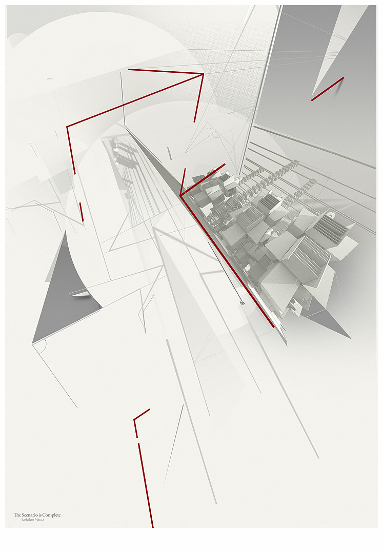
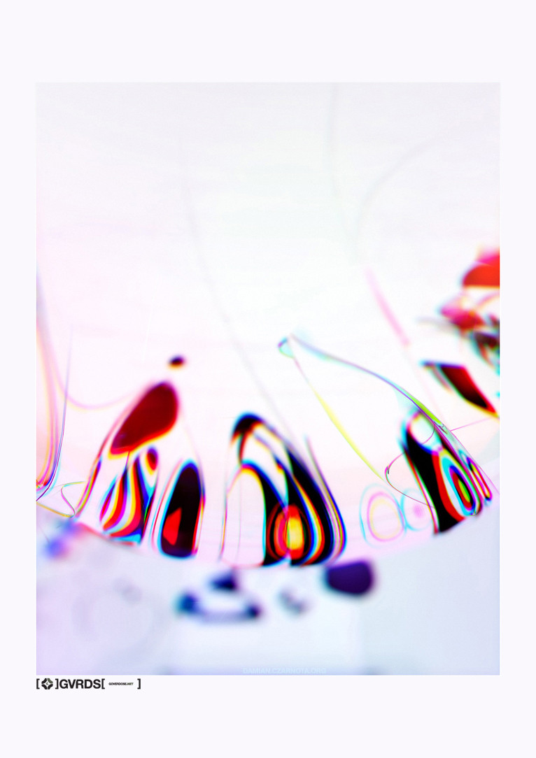
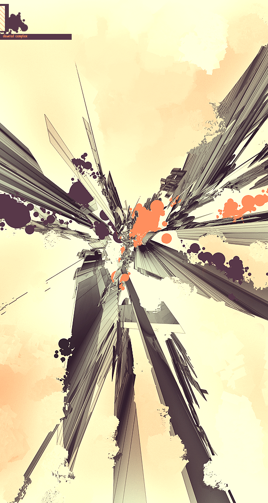
Description
collaboration between boski { check his gallery here : [link] } and me (Wink)")
Related content


Comments: 124


ok even as i see people who speak polish are going to a bit easier for u respond to. i like technical graphic structural style of it and it is definitly not over worked at all.
just wondering what programs u used? whether it was bryce/illustrator or photoshop? any help would be much appreciated thanks
 (Smile)")
👍: 0 ⏩: 0

somehow reminds me of this "lady coming down the stairz ..." thing
The mood ...
I guess it was a duchamps.
Fine work.
Compliments to you both.
👍: 0 ⏩: 0


the title matches the artwork... or is it the other way round...
👍: 0 ⏩: 0

How did you make the third one? It looks like it could look REALLY good as a painting up on a wall. Plz tell me what you used.
👍: 0 ⏩: 0


ohhhh hell yeah!! this is what i call fantastic designing! awesome collab!
👍: 0 ⏩: 0

I wonder how i missed this one. Great work from you two.
+fav
👍: 0 ⏩: 0

The complexity of this peice is almost too much to handle, i think this is up there with some of the greatest digital abstracts up there, the construction of each section is unbelievable.
👍: 0 ⏩: 0

this is so cool. One of the best designs I´ve ever seen on DA (beside my works, of courcse
No seriously, man, this is so innovative.
i LOVE the paper effect.
The best thing is the contrast between abtract forms, and real, solid paper.
Very interesting.
You´ve well earned this +fav!
👍: 0 ⏩: 0

Rrrrrr ")
👍: 0 ⏩: 0


erg rare combo als je er goed gaaat kijken, maar zeker wel mooi gemaakt +fav
👍: 0 ⏩: 0

yummy... its awesome! especially the two on the left. Love its dynamics and colorschemes. The old paper kinda background works very well with its tight vectors.
big up...

👍: 0 ⏩: 0

Mmm, delicious combination of abstract and manipulation. Great design, nice soft textures, and nice rich colours.
It's a shame I've never seen this before.
+fav.
👍: 0 ⏩: 0

")
")

naprawde chcesz?
jak cos to moge ci podeslac
👍: 0 ⏩: 1

sie nie pytaj tylko podsylaj wszyskie warianty tego rendera :d
👍: 0 ⏩: 0
kurwa, jakie to jest zajebiste
nacieszyc michy nie moge
👍: 0 ⏩: 1

kurwa, jakie to jest zajebiste
gdzie ? :>
👍: 0 ⏩: 0

Well if this isn't completely fav-able nothing is. Lovely tones and an excellent use of combined styles in 3 and 2D which makes the work stand apart from all the other 3D stuff which I like but is most of the time kinda similar looking, not really innovative and lacks it's own character. This work hower has all the right elements and succeeds where other fail to me. Great work in other words. Keep it up.
👍: 0 ⏩: 0

i don't know how i missed this, but i am now speachless +Fav
👍: 0 ⏩: 0

those are 4 awesome images, i love the different styles in them and the colours
fav!
👍: 0 ⏩: 0


dawno sie nie przygladalem tak dlugo jednej pracce
Congrats
👍: 0 ⏩: 1
ale zobaczyles tam cos ciekawego wogole ?
👍: 0 ⏩: 2
nie gdzie tam ogladam bo mi sie totalnie nie podoba
hyhyhyhy
👍: 0 ⏩: 1

nie gdzie tam ogladam bo mi sie totalnie nie podoba
hyhyhyhy
👍: 0 ⏩: 0


b-e-a-utiful
one on the left is so sexy
the others are sweet too
man this is awesome
👍: 0 ⏩: 0

aaahh, that rocks dude. love the colours and composition.
👍: 0 ⏩: 0

yea i forgot to add my comment on this. very original first of all. second your use of abstract shape totally works with the style youve selected, its both retro and futuristic. it reminds me of syd mead concept drawings, the 1960-80s ones. u should check it out because you will get a better idea of what youve accomplished right here which is something very stylish and unique.
👍: 0 ⏩: 0

my god that is just fuckin sweet as hell.
awesome colors and design, very clean work. +fav
👍: 0 ⏩: 0


Great work. I like the textures...this looks like it was done on newsprint. The progression is really nifty. I like how it gets more and more choatically energetic with each panel. I like how the 3rd panel is the darker than the last panel...kind of like it's darkest before it really gets chaotic.
👍: 0 ⏩: 0


Yeah this is soo hot. Very mature and sweet prints. Great work.
👍: 0 ⏩: 0
| Next =>