HOME | DD
 dolt — FrozenAndBurnt
Published: 2002-03-24 10:19:31 +0000 UTC; Views: 1139; Favourites: 3; Downloads: 509
Redirect to original
Description
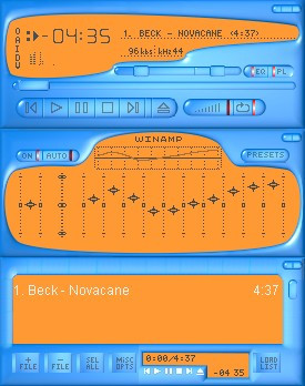
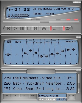
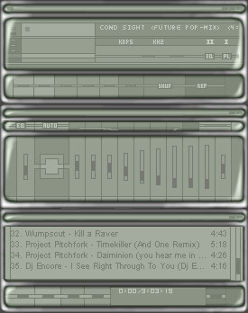
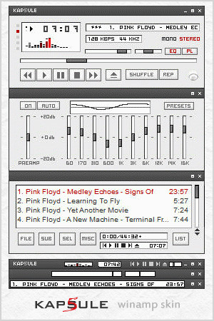
It's orange and blue.Fixed up the eq and sliders.
Related content


Comments: 9

that's a nice shape you gave it all... as for the colors i'm personally not too big on them.
a silver instead of baby blue would have been my choice for a shape like that. give it abit of a melted metal look to it like it was puddling sround the orange.
all in all looks good.. keep it up
👍: 0 ⏩: 0

I have wallpaper in exactly the same colors. Thanks ))
👍: 0 ⏩: 0

yea i think what gumby said is a good idea. change and orange to black and the text to like white or dark blue.
i still like it thought
-----
There was a man in the woods, a man named Fart. What? A man named what?
👍: 0 ⏩: 0

original design. i like the odd shapes.
-----
angelsfaithDOTtk::: http://www.angelsfaith.tk
👍: 0 ⏩: 0

Very slick 3D look. I like the simple yet detailed buttons.
My only complain is it's just too much orange. What about desaturating it, or changing it for another less intense color?
👍: 0 ⏩: 0

Really nice! I like!It is... cute!
Vraiment bien! J'aime! c'est... mignon!
👍: 0 ⏩: 0

Wow dude, thats tight. Would it be possible to change the orange to black, and the text to white? I think it would look a lot better like that. Or maybe if the orange was a lighter color blue with darker blue text.
👍: 0 ⏩: 0

Hey...this isn't bad! It's different....I like!
-----
Proffasee :: Seeing The Future
__________________________
http://www.digitallypoetic.com
👍: 0 ⏩: 0
