HOME | DD
 DouglasEltz — Grove Layout
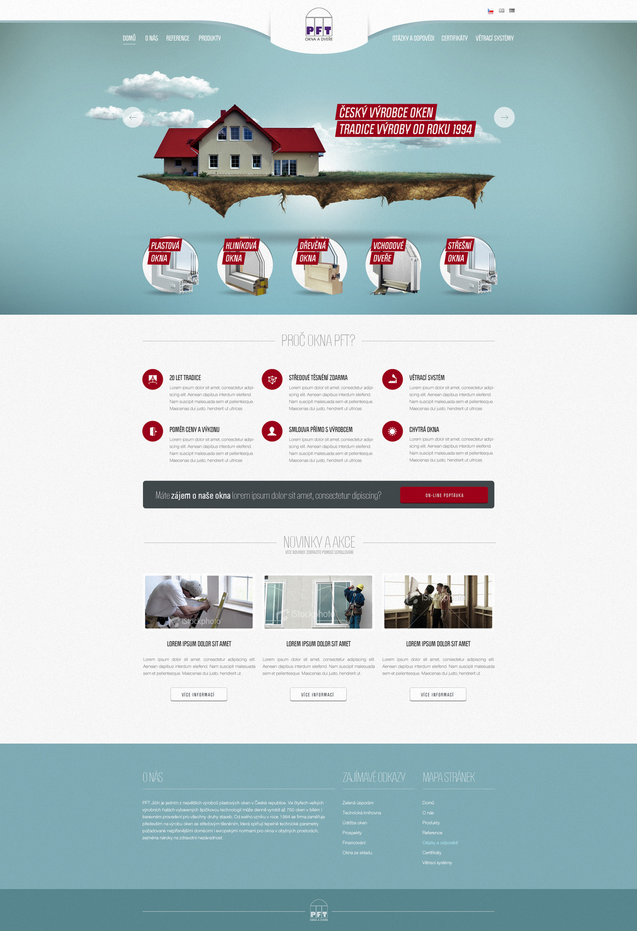

Published: 2009-02-15 18:06:20 +0000 UTC; Views: 13880; Favourites: 100; Downloads: 303
Redirect to original
Description
...Related content


Comments: 144

n gostei da posição do logo/nome do site, tirando isso achei bem baum +

👍: 0 ⏩: 1

You can change the color of logo to yellow, but layout is very cool, nice colors, fresh icons, good work ;]
👍: 0 ⏩: 1
")


technicely not bad, but mess in the content, If you wouldnt put this big photo on the top I wouldnt even know what about is this website.
👍: 0 ⏩: 1

I will follow your tips in the next, Thank you,Jarek.
👍: 0 ⏩: 0

ficou bacana cara
parabéns o símbolo do logo tah legal também.
👍: 0 ⏩: 1
No.
I'm not Web Designer
I'm have one Web Designer to code the layouts.I'm Graphic Designer.
👍: 0 ⏩: 1

I think the four columns on the design should lign up with the two columns underneath, looks kind of odd.
👍: 0 ⏩: 1

great use of icons  (Smile)")
👍: 0 ⏩: 1


Legal..vc ta evoluindo bastante..mas vc faz as coisas muito em um padrao só...
👍: 0 ⏩: 1

curti! se fosse uma imagem amarelona melhor ainda ")
abraços!
👍: 0 ⏩: 1

 (Wink)")


<= Prev |