HOME | DD
 DouglasEltz — viseno.com

Published: 2009-03-25 01:14:25 +0000 UTC; Views: 9588; Favourites: 66; Downloads: 141
Redirect to original
Description
...Related content


Comments: 108
")


")

Desconsidera minha ultima frase, não fez sentido para mim!
👍: 0 ⏩: 1
Brow, tu com a simplessidade na mão você faz coisa incrives.
Só não gostei muito do fundo acho que não conbina comigo ¬¬'
zoaa
Sua profissão já ta feita, agora só falta você se profissionalizar ;D
👍: 0 ⏩: 1


 (Wink)")


really good work at it  (Smile)")
👍: 0 ⏩: 1

I don't know,the logo is resource for one contest.
Thank you buddy
👍: 0 ⏩: 1
no probs!
👍: 0 ⏩: 1


Uma coisa muito legal que você fez foi juntar dois tons diferentes ( o escuro e o claro ) e harmonizá-los.
Enquanto aos itens, estão um pouco soltos. Penso eu que um fundo com a cor de fundo mais opaca em cada um resolveria o problema.
Fora isto, está show de bola. Simples, clean, soft ... muito bom, parabéns.
👍: 0 ⏩: 1


Tah show cara parabéns
mas como o sinthux falou
deveria ter dado mais atenção na divisória ali dos produtos
tá muito "voando"
Abração
👍: 0 ⏩: 1
Hmm.
Vou tentar melhorar.
Abraço.
👍: 0 ⏩: 1

Amazing work, but there's a typo in the header. "Free, Easy to use and No Installation"
I believe it's supposed to say "no" instead of "not"
You're amazing at this mate !
👍: 0 ⏩: 1


ficou fodão esse seu melhor de longe!
👍: 0 ⏩: 1

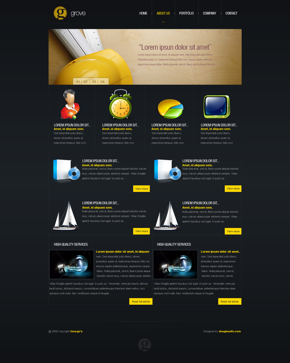
There should be some more defining separation in the individual products towards the bottom, and the stroke/outline for the blue buttons is green.
Other than that, I like it
👍: 0 ⏩: 1

| Next =>