HOME | DD
 dr-devil —
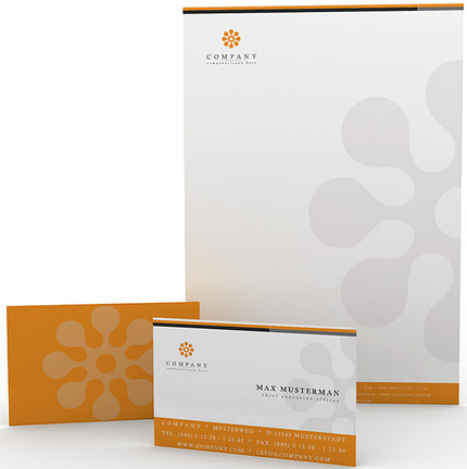
Corporate Design 5
dr-devil —
Corporate Design 5

Published: 2006-01-25 16:12:59 +0000 UTC; Views: 65234; Favourites: 192; Downloads: 8353
Redirect to original
Description
Brochure, Letterhead, CD, CD-CoverA suitable mockup can be purchased here: [link]
Related content


Comments: 50


I Like your clean design work. I am looking for several contract graphic designers for some print based, corporate design work. I have a full description on my deviant page below with an example of the type of work we would like. Can you please take a look at it and let me know if you are interested.
Deviant Link: [link]
My Email: mail@ayms.com.au
I hope to hear from you in the next day or so. Either way your work is great and I am a fan.
Mike
👍: 0 ⏩: 0


thx all for the comments !!!
Made with Photoshop and Illustration with 3D.
It was made for presentation and the "company" is only in my brain
sorry for my bad english


👍: 0 ⏩: 0

From a graphic designer's POV, the piece is solid. The composition of image and type is simplistic, yet well-balanced, and the color works well too. Kudos...
Is this for a client or a personal project, or is it a project for a client?
👍: 0 ⏩: 0

Looks good. Nice, clean lines, and very simplistic yet stylish design.
A+, my friend.
👍: 0 ⏩: 0

")


Daily Deviation ................... bravo 
👍: 0 ⏩: 0


this is a simplistic corporate look. typical yet eccentric. intricately detailed and strongly definitive of the company. good job.
👍: 0 ⏩: 0


not bad.
it's green! my favorite
but the X looks kinda fake. =X
👍: 0 ⏩: 0

This is great work very nice. The green works perfectly here.
👍: 0 ⏩: 0


hooooot design! very smooth and clean, gotta love it! you deserved that DD!
👍: 0 ⏩: 0


i'm in a design class now and we're doing stationary.  (Smile)")
")
👍: 0 ⏩: 0


Great work, the colours work together perfectly, nice, clean and professional.
👍: 0 ⏩: 0


 (Wink)")


0.o I like it. It's simple but yet it very much suits. Nice job
👍: 0 ⏩: 0


awesome. lovely done.
-clean, armonious and clear design
👍: 0 ⏩: 0

your work is so simple and yet so nice ............ well done
a very nice work
👍: 0 ⏩: 0

