HOME | DD
 Dreamaaa — Polluted
by-nc-nd
Dreamaaa — Polluted
by-nc-nd

Published: 2006-08-14 15:24:24 +0000 UTC; Views: 1099; Favourites: 16; Downloads: 1
Redirect to original
Description
An immaterial but visible being that inhabited the air whenthe air was an element and before it was fatally polluted
with factory smoke, sewer gas and similar products of civilization.
-Ambrose Bierce
This was created by me in photoshop and took a few hours.
I found a quote as you see above that i thought worked well.
let me know what you think about it!
")
NOTE: NONE OF MY WORK MAY BE USED
IN ANY WAY WITHOUT MY PERMISSION!
Dreamaaa
Related content


Comments: 22

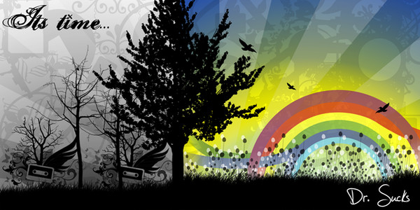
Great design and concept. I love the contrast between all the colors above, and the black and white below. Really conveys the message well. Awesome job.
👍: 0 ⏩: 0

I like this work for two reasons: the concept and the way you represented it
the sky above pollution looks so nice
👍: 0 ⏩: 0

The thing that drew me to this image was the intense coloring at the top and the combination of crisp lines with blurry ones. The use of patterns suitable for each frame makes the entire image even more interesting to look at.
I do think the text in the bottom panel detracts from the work; somehow it doesn't really seem to fit with the purely graphic nature of the top panel.
Overall, though, a very effective piece with a clear message. Good work!
👍: 0 ⏩: 0

Wow, another great concept. I like this one muchly.

👍: 0 ⏩: 0

i just watch an inconvient truth last night, and this really reminds me of it. very nice piece for a good awareness cause.

👍: 0 ⏩: 0

This has a nice concept  (Smile)")
👍: 0 ⏩: 0

I love the concept. The starkness of the lower image really makes the upper image special. The colours are gorgeous.
👍: 0 ⏩: 0

this is a great picture and all the colors fit so well
👍: 0 ⏩: 0

Neat concept and nice execution! I see a bit of a jagged edge along the clouds up top, but maybe that was intentional? Great work. : )
👍: 0 ⏩: 0

Great contrast between the two worlds - i like how you've made the free one all colourful and then the barred one just dull black and white - creates an awesome effect! xxxx
👍: 0 ⏩: 0

awsome.
love the 2 types of art bringing the aspect 2gether
👍: 0 ⏩: 0

this is awesome
👍: 0 ⏩: 0


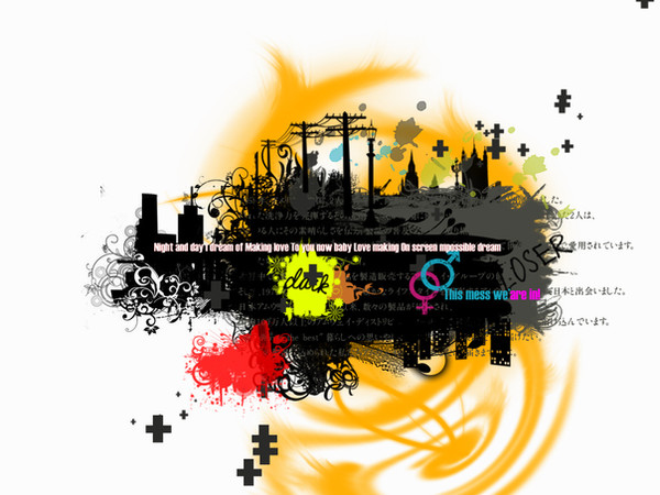
we seem to be nearly like the cancer to this earth and I wouldn't see why Mother Earth isn't too eager to see us hanging around there for a little while longer. As we had the perfect paradise, with everything going all smoothly and beautifully and yet that seemed to get kicked to crap when human nature and naive and stupidity seemed to spawn from the fitting asexual reproduction of the ego. And no I don't mean the Freudian one, as i mean the part of all of us that wants to make ourselves out to be the biggest and the baddest. The colors seem to almost represent our diversity through out the entirity of getting the Earth overtly too pissed off at us, and also the black and white of the bottoms seems to show the levels of degree and the levels of apathy that seems to be within all of us to care, the black hearted folks are the guilty ones and the white ones are the pure or also could be naive to the fact as we pollute this home we call earth.
👍: 0 ⏩: 0


Nice, but I don't like the fact that the birds are blurred...
👍: 0 ⏩: 0


I love the contrast! It is great! Great concept also. You did a great job with that one!-Steve
👍: 0 ⏩: 0

I would like it much more without the "noisy" and the "hazardous" parts in it. Yes they are true, but I think it makes the bottom half of the image seem cluttered.
👍: 0 ⏩: 0

I love the colors you used... it definitely helps with the separation of the two scenes.
👍: 0 ⏩: 0