HOME | DD
 E09ETM — Endless Power

Published: 2007-06-08 12:30:05 +0000 UTC; Views: 21231; Favourites: 1210; Downloads: 297
Redirect to original
Description
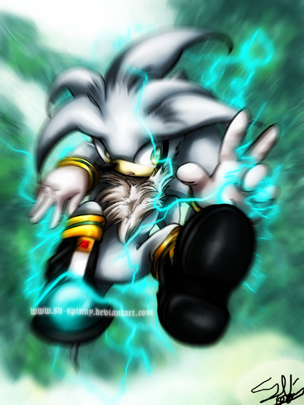
hi~long time no see.what,my style has changed again
 because I was playing BASARA and I really admired the offical artworks.
omg,I want to play a sonic battle game as exciting as BASARA.
yeah...thats all.hope you like it^_~
back to study TAT bye
Related content


Comments: 168


awsome!!!!omg!!!! i love them when they'r in super form
👍: 0 ⏩: 0


 (Cool)")

")

I love the coloring style on this pic, its very unique and whatnot!
👍: 0 ⏩: 0

shadow's the sexiest in this picture,love it!!!!!!!!!!!!!!!!!!!!!!!!!!!!!!!!!!!!!!!!!!!!!!!!!!!!!!!!!!!!!!
👍: 0 ⏩: 0


Awesome. Fav'd. Oh and BTW, but What does BASARA stand for?
👍: 0 ⏩: 0


Gah! I love your style, and the overall look is amazing! How do you do it?
👍: 0 ⏩: 0

Wow. that. is. AWESOME!!! sonic 06 was interesting but it sucked that sega made Blaze miss out on all of the fun
I think it was so there would be three hedgehogs, not two and a cat ")
👍: 0 ⏩: 0


HELL YEAH!! ^_^ *Favs*
I LOVE the Super forms and the way you drew them!
👍: 0 ⏩: 0


Wow, truly amazing. It looks like the old Marvel or DC comic books. ^^ Awesome job!
👍: 0 ⏩: 0


Wow nice Styl! But Burning Blaze haven't so long hair.
👍: 0 ⏩: 0


I applaud you. This is spectacular, a job well done indeed!
👍: 0 ⏩: 0


 (Wink)")

👍: 0 ⏩: 0


Ooo, very nice coloring job, I can see the power eminating off of all of them, heh.
I love the poses that they're all in, excellent job =3
*favs*
👍: 0 ⏩: 0


I like Blaze, but I still wonder why people draws Super Blaze along with the super hedgehogs?
👍: 0 ⏩: 0

Wow. O:
Very intense drawing. I love how the shines are highlighted with bright colors, while the rest of the image is relatively dark. That looks great!
👍: 0 ⏩: 0

Fav'd.
An impressive display of the super forms of Sonic games. Interesting how this seems to focus on shadows with limited light while most super form pictures have a lot more light shineing on them due to their shinyness.
👍: 0 ⏩: 0

OMG!
My english isn't good enough to express how awesome that is!
👍: 0 ⏩: 0


They're like the Fantastic Four only more AWESOME!!!!!!!!!!!!!!
👍: 0 ⏩: 0

[
👍: 0 ⏩: 0

*_* wwwoooowww.. too cool *-* really your art inspires me... 
👍: 0 ⏩: 0

omg! that's awsome,i like way you made Blaze O-O
👍: 0 ⏩: 0

awesome! I love the glow around Sonic and the highlights on Blaze. Looks very sketchy, but that really makes it look cool^^ sweet new style, I love it!
👍: 0 ⏩: 0

Wow! This pic is an awesome kick ass!!!
Omg your style is cuteeee!!!
👍: 0 ⏩: 0

the good:
the characters actually look like they are supposed to, and show some really nice emotions and blaze has a cool pose that is calm and opposite to the others.
the bad:
the colouring, lighting, shading and lineart is awful. it looks as if you spent around 5 minutes creating this image as it doesn't seem like you put any effort in at all ¬_¬ your previouse style was much better. the background is lacking, well a background.
the image lacks a focus and the viwer is confused where to look quite frankly.
How you could improve:
firstly go back to the style that you are good at because it looks much better. secondly put some effort in if you are going to use this style make sure that you have some focus in the image otherwise the image will be boring as the viewer has so much to look at that they will become confused. I would also reccommend trying to draw somthing other than fanart all the time as this will show youre creative streak more.
its up to you weather you take this in or not, and if you really can be botherd then a reply would be nice. thanks ^_^
laters
-S.H.117-
👍: 0 ⏩: 0


| Next =>