HOME | DD
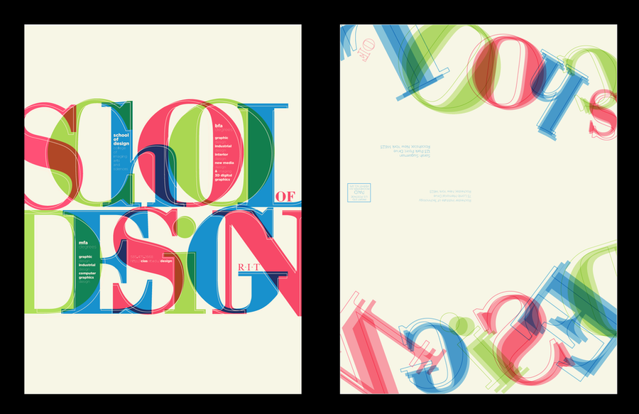
 e3rian — UTE - Tangram Typeface

Published: 2007-08-29 01:06:15 +0000 UTC; Views: 8797; Favourites: 64; Downloads: 0
Redirect to original
Description
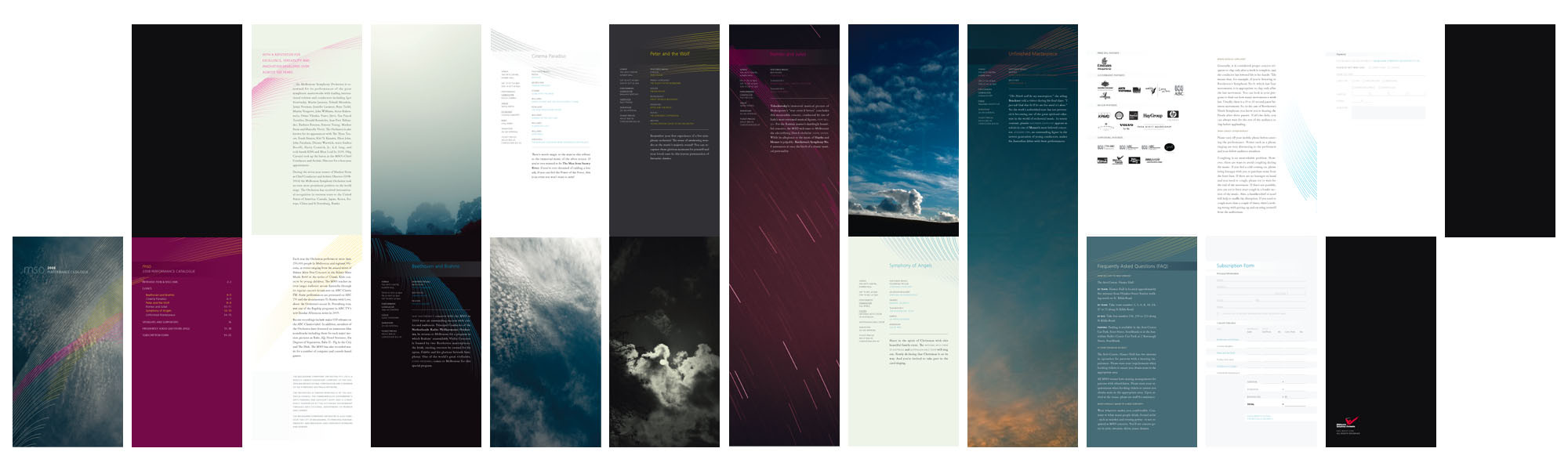
UTE - University Project, Design StudioDigital Publication, Tangram Typeface
We were set the brief to create a challenging and experimental magazine that should be viewed on a computer (namely a pdf), the focus was on Melbourne and targeted towards a cultured business sector that are both affluent and technology-savvy.
The tangram is a major component in the solution, it acts to identify the publication, it serves as a navigational tool that requires some engagement from the audience and it is also the basis of the overall aesthetics.
This is the lowercase alphabet (without numbers or punctuation) and will be used as a feature article in the publication to draw attention to everyday uses of typography within the city.
Please don't try to use it, as individual letters are not proportional to each other and will make every word look ridiculous!
Related content


Comments: 9


this is extremely original and ridiculous!!! (in a good way) lol
👍: 0 ⏩: 0

Ooh. Highly original! And I can see how it was Melbourne-influenced. Nice work!
👍: 0 ⏩: 0

 (Smile)")
