HOME | DD
 eddsworld — Simple shading test
Published: 2009-06-01 09:59:22 +0000 UTC; Views: 31971; Favourites: 285; Downloads: 3826
Redirect to original
Description
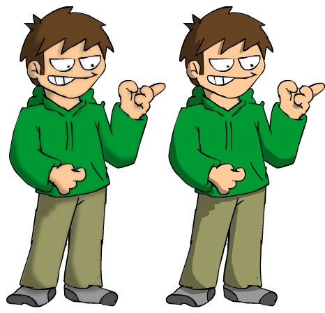
I'm usually pretty terrible at shading.. so i thought i would give it another go.It's difficult to make it not look dramatic, but after Paul helped me by telling me to remove some of the more human shaded parts, im quite happy with the result.
Not sure which of these is better, i think i prefer the one on the right for animation, but the one on the left for drawings and stuff.. but what do you guys think?
Related content


Comments: 81


I think the one on the right is better.
And as long as you know your light source you'll be okay. Some people do bad shading because there is no light source. Just choose a spot for light to come from.
👍: 0 ⏩: 0

I agree with you.
Right for animation, left for drawings.
Socks on none D: <
👍: 0 ⏩: 0


I think the one of the left could be used for serious pics, and yah the one of the right for animations~
👍: 0 ⏩: 0

")

The trick to shading in my opinion is to find a shading style that is simple and easy to do, but at the same time still looks good. I think you gotta good thing going with the right one, I wouldn't know if it would be painstaking to repeat in animation but I think it looks nicer.
Complexity isn't always better.
👍: 0 ⏩: 0


i am agree with you... but why do you want to put shadows on the animations... they are not so necesary O3O
👍: 0 ⏩: 0

Yeah, soft for drawings, but in animations right would hit the spot more, I think.
👍: 0 ⏩: 0


I prefer the softer shading to the left.
👍: 0 ⏩: 0


I agree with you, left for comics and stuff, right for the animations
 (Wink)")
👍: 0 ⏩: 0

Both would work.
All you need to keep in mind is where the lightsource is and how the light hits the object.
👍: 0 ⏩: 1

Yeah, there are some other tests where i tried the different places the lite could come from.
👍: 0 ⏩: 0

You know whats fun?
Crossing your eyes until you get a third image between the two, then relax your eyes and it looks real sharp and sexy.
👍: 0 ⏩: 3

I am seying 4 edds now... Wait now 6... WAIT WTF 10... WTF 33 HELP ME
👍: 0 ⏩: 0

Holy fosnizzle!! lmfao thats awesome!
👍: 0 ⏩: 0
Damn wish i could use the middle one!
👍: 0 ⏩: 0


Oh, wow! What a fantastic job! I'm normally afwul at shading, myself.
👍: 0 ⏩: 0


I agree, right for animations and left for drawings
👍: 0 ⏩: 0

You should defiantely go with the crisp 'cell-shading' effect; it gives the shadows more definitition.
👍: 0 ⏩: 0

I agree. I think it might be a little more difficult to use soft shading in animation than shading that's more crisp. Also, I know it's just the soft shading that's blurred, but it makes it appear just slightly that Edd on the left is thrown out of focus.
👍: 0 ⏩: 0

I prefer the one on the right. It looks better, stronger in appearance than the one in left.
👍: 0 ⏩: 0

I agree. The one on the right looks way better for animation. And the other shading would look better suited as drawings. :]
👍: 0 ⏩: 0
<= Prev |