HOME | DD
 edf — Drift 1
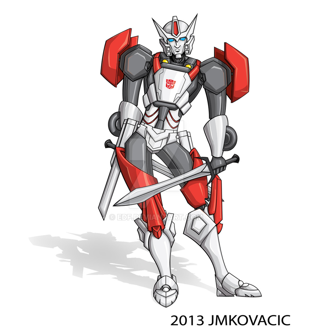
Published: 2013-09-30 15:55:44 +0000 UTC; Views: 1364; Favourites: 30; Downloads: 0
Redirect to original
Description
Well, here it is, all done.Few things I want to state- Initially I was trying to go for a more TF Animated style, but I have indeed reverted back- but didn't really change the legs. I hadn't noticed he was having a more feminine figure then me til way into the coloring. However, it didn't bother me so much as to have to redo everything, so it stayed. Oh well- I know what to look for in the future.
** edit- also, been pointed out to me via some helpful peeps on th eforum that he is off-balanced- why did I not see this? I could have fixed it easily with the line art. His shoulder should have been slanted the other way.... oh well, one more thing I have to look out for!
Everything was done in illustrator except for th shadow. I just didn't want a flat white background but I am not really doing much of a bg.
Also, not sure how the shading looks. I am rather new to this style of vector- doing color and line art in Illustrator. Also, never really drawn anything that would have a metallic shading to it considering I just started drawing transformers in the past year. I know I can prolly do a lot more with illustrator- the problem is, I simply do not know how. See, for digital art, I am pretty much self-taught, and even when I did some comp classes, the versions of Illustrator where much much older ( heck, this was created with Illustrator CS6 and it is much different then what I was used to on the old comp- which was CS3.
I really am wanting to learn more about illustrator and such. If anyone has any tips or tutorials to help, I am all ears.
While I am happy with this drawing, And yes I do feel I got th emetalic feel for Drifts shading, I know it can be better. I like this better then my photoshop coloring, but I am really wanting to learn more about the program so when I am coloring in, I am not stuck with the limitations of what basics I know in illustrator.
Anyways, this is Drift, drawn like he is in the MTMTE comics.
He don't belong to me, I just drew him.
Hope you all enjoy!
Related content


Comments: 61

Very well done with proportions and love the bold lines in your work! Good job!
👍: 0 ⏩: 1

thanks! I worked on the line art for a nice long time and I love doing lineart! the coloring part is fun, but I need more work on it- mainly more experience with using illustrator.
👍: 0 ⏩: 0

Wow this is so cool. Love the straight lines. Maybe I'll try Illustrator for one of my drawings one day.  (Smile)")
Love the pose
")
👍: 0 ⏩: 1
you know, I am so anal about th elines, that sometimes I wish my lines where looser. Looser lines can have more energy to them. But try out illustrator- can be another means to do your art.
thanks for the comment
👍: 0 ⏩: 1

Your shading is very good, especially considering you're new to shading in illustrator! I love illustrator, but it can be complicated! It looks like the shadows and highlights are placed perfectly!
👍: 0 ⏩: 1
thanks- I am happy with the shading, just need to practice on it with illustrator- I think th shading is a little flat, but I am teaching myself stuff in illustrator to try to get better.
👍: 0 ⏩: 0
I have to say pretty good with the coloring and how the shadows are in the corrects spots. If it was me I would add highlights to the eyes, that's just an extra detail. Besides that great Job
👍: 0 ⏩: 1
there is some on the eyes- prolly just not enough as I can barely see it on here. thanks!!
👍: 0 ⏩: 1
<= Prev |