HOME | DD
 edit-dsn —
JOCID CD Cover
edit-dsn —
JOCID CD Cover

Published: 2004-05-06 16:50:23 +0000 UTC; Views: 44965; Favourites: 409; Downloads: 13099
Redirect to original
Description
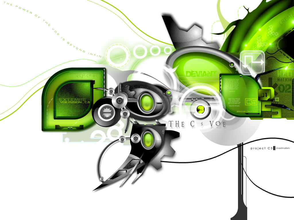
4-page digipack cd cover i just finished for a psy artist from Holland called Jocid. It's the first release on a new psytrance label called SONIC DRAGON. I was trying for a cellular/organic-meets-cold-digital , but wanted to keep it minimal.::specifix::
photoshop
illustrator
3D
caffiene
* Just released and is available through saikosounds, you can preview the tracks too [link]
** Sonic Dragon's second release BENZA - RETROFUTURISM is just about to be released. check out the artwork here [link]
Related content


Comments: 298

you are welkome ... if you can see my gallery and say me your opinion when you have free time :d
👍: 0 ⏩: 0

It's so best, lots of details, defenitely eyecatching and very modern...
👍: 0 ⏩: 0

Hey man, we have a mutual friend [Teniso]. She has shown me a few of your designs in the past, and i happened to come across this one via the handy 'random deviation' button ")
Especially impressive is the placement of all the elements in this piece, you have a real eye for aesthetic flow.
How long does a piece like this take?
👍: 0 ⏩: 1

heya, yeah nijne talks about u a lot hehe. glad u like the design, i was really happy when it all finally came together. Yeah i was commisioned for this piece, it's the first release off a new label, all up it took me about 1 week for this one, but that was stretched out over 2 weeks while i did other jobs. i still havnt seen the finished product though, still waiting for the release.
thx for the comment and glad u like it.
👍: 0 ⏩: 2
hehe communal stroke, i like that
i'll let u kniw about the cd. cheers.
👍: 0 ⏩: 0
She speaks of me alot, hm? (all bad, i'm sure heheh).
How were you chosen for the commission? Wondering if this place results in any jobs, or just serves as a communal stroke site of sorts
When it comes out, let me know -- I might pick one up for the packaging alone
 (Wink)")
👍: 0 ⏩: 0

shit dude, fuck its fucking awesome...i honestly dont have anything more to say m8...apart from...
👍: 0 ⏩: 1


well i'll have to add my voice to the applause ... this is incredible professional work
ima trip hop fan myself ... a big fan of Massive Attack
if Jocid is half as good as your art is ... i'll have to give it a listen
👍: 0 ⏩: 1
hmm, im not entirely sure on what this cd sounds like, their old stuff is not really my flava, bit too full-on, but they might have changed their style since then. available from the saikosounds website though.
thx so much for all your comments and support
👍: 0 ⏩: 0

")


amazingly, i'd buy that without even knowing what it is.
👍: 0 ⏩: 1

mad, really mad. what kind of psy does he play? i havnt read tall the comments so i dunno if this has been asked, whats the url for their site?
👍: 0 ⏩: 1
dark techy prog. sort of full on shit, but not in an arpegiated-303-synth, hard and dark. not sure on their website. but it will be released through saikosounds, so check there for details. just heard yesterday that the printing is happening right now, should be out soon.
thanks for the comment.
👍: 0 ⏩: 0


wow! i would buy that just because it looks so damn cool!!
👍: 0 ⏩: 1

That thing is OFF THE HOOK. 
The neurotransmiters are astounding. Thanks for posting this.
👍: 0 ⏩: 1
yo thanks for the props  (Smile)")
👍: 0 ⏩: 0

it look fantanstico, a really brilliant job

👍: 0 ⏩: 1

Amazing work, very clean and professional. I like the colors and fonts you chose. The overall compisition rocks. Inspirational work
👍: 0 ⏩: 1


New work!
nice
I think its a great cover, you seem to like green
Your presentation of it also looks very nice.
Good Job!
👍: 0 ⏩: 0


WooOOOoooHOOO! 100 favs! rock on mate!
👍: 0 ⏩: 0


i love this. i think its the color scheme that really draws me in to it. the cd label circuitry is freaking fantastic, +fav
i want to make this kinda stuff
👍: 0 ⏩: 1

with a quick glance it kinda looks like the sonyericsson logo
👍: 0 ⏩: 0


Great design, inside and out. Not only is the case wonderfully created, but the disc image is some of the best work I've seen as far as CD art goes.
I love your merging of the "techy" look along with the minimal feel. You've got all that detail there, but it doesn't overwhelm the design and cause a "busy" look at all, a problem with most tech designs. The heavy black and green on top of the white background makes for some great contrast. The ball of intertwined green "nerves" is perfect. Not too busy, not too simple. Very nice subtle effects you've added to it as well.
As far as the disc design goes, it's perfect. You left a few places for text (compact disc logo) and filled the rest of the space. It's bold, it's fun, and it's unmistakeably unique. Great job on that.
Overall, it's very much worthy of the Daily Deviation you received. Props to one heck of a design!
👍: 0 ⏩: 1
thanks so much for the extended feedback! it's great to get a breakdown of the design.
👍: 0 ⏩: 0

Nice, very nice. Congrats on the DailyDev.
👍: 0 ⏩: 0
<= Prev | | Next =>