HOME | DD
 edxecutor — Ghost in da shell

Published: 2001-12-25 03:53:15 +0000 UTC; Views: 1341; Favourites: 6; Downloads: 240
Redirect to original
Description
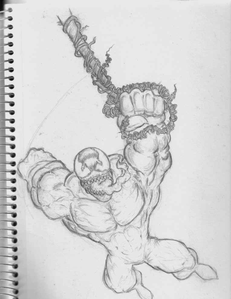
My first deviant submit. 100% photoshop made. Took about 4 hours. I was messin around with a new style.Related content


Comments: 17

is been a while but i had to come back and add it to my favorites...
👍: 0 ⏩: 0

thats just awesome, I think Ive told u I love it like 10 times now.
Ed... what are u thinking? Did I really hear u say something about getting a 3d prog? =\
-----
Im lost in digital space, wtf?!
👍: 0 ⏩: 0

just amazing photshop work...very nice...i love it...your on deviant watch
-----
::the new state of design::
are you ready? https://tdawg.deviantart.com
👍: 0 ⏩: 0


Wow, that's really sweet. I love the lighting coming out from behind there. Unfortunatly the thing that spoils it for me is the retarded "da" in the piece. Is it that difficult to say "the"?... ah well.
:: exy BrazenSix(Mathias) ::
:: The snowman outside my igloo tells me to burn things ::
👍: 0 ⏩: 0

I'm getting 3d Studio Max R4 soon. I'm gonna be making more pure photoshop images though. Right now I'm workin on a couple of other things. I'll be doing stuff, and next kewl image I make, I'll make sure you see it.
----
I like some of my work Dont be so mean as to criticize others work too much
👍: 0 ⏩: 0

Thats fucking awesome, we all want to see more! Why dont you do more? your so good at it!
*ph3tish (jon@lipking.com)
👍: 0 ⏩: 0

Very nice! Almost organic-looking. Quite creative.
If this is what I need to be inspired.
I choose to not be inspired at all.
👍: 0 ⏩: 0


that shit is GREAT edxecutor compared to your other stuff. i cant wait to see your next img on that style, use blue on it instead of green please lol i love that color. if this image was blue instead of green you got A++ for all of them.
👍: 0 ⏩: 0

NIIIIIIIIIICE... I like that one a lot... thanx for the wp . Nice technique and for the first time in a while the name actually had to DO with the image. Thats always nice to see
👍: 0 ⏩: 0


I have to agree with pax on the Image title and typo...
The background is very nice.... GOod job on pure photoshopwork! Keep it up.
👍: 0 ⏩: 0

well.. i'd just say i wanna be like you...
your wallpaper ownz..
👍: 0 ⏩: 0

I think the colors are a little bland for an image that moves like this one. Also the text is a little strange. Plus using ghost in the shell...I duno, I just dont like that name. Doesnt fit the image. A strong image will have a theme that is based off a title, not the other way around. Me, I think of a title first then work my image around that title.
------
The Key to this inner world is imagination, which gives expression to those intuitions that mark each persons unique being.
Pax Magilantic
Project: SlipStream
------
👍: 0 ⏩: 0

this is really nice for ur first deviation, ilike it all except for the text, u have some nice skills to be developed
~insanity does not = misery~
👍: 0 ⏩: 0