HOME | DD
 einvoid — -forgotten-

Published: 2002-09-27 22:08:03 +0000 UTC; Views: 812; Favourites: 0; Downloads: 34
Redirect to original
Description
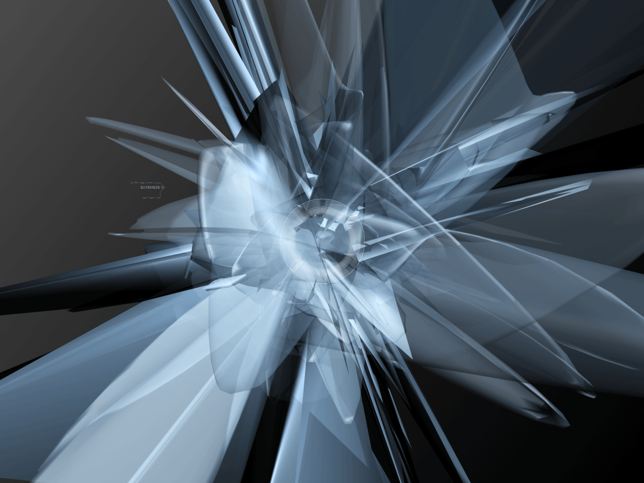
New site that I am thinking of using. Please, I need lots of your thoughts on what is good and maybe what could be added.Related content


Comments: 5


very very nice!
it does look very professional.
maybe try and make the text stand out a bit more.
great work tho!
👍: 0 ⏩: 0

I really like the pale colors of this one - it's muted and mild, yet very professional looking.
👍: 0 ⏩: 0

I like this - has a DR flavour, similar to a Satoshi Tomii sleeve I've seen.
As a communications tool (which is how you should think of websites), it might be a little too flat, in terms of colour. I'd seriously think about throwing in a strategic splash of orange or cranberry - nothing too extreme, just a little device to draw the eye.
Look forward to seeing the finished product!
👍: 0 ⏩: 0