HOME | DD
 ejsing — Image Hosting Layout

Published: 2009-06-26 14:54:21 +0000 UTC; Views: 16517; Favourites: 105; Downloads: 660
Redirect to original
Description
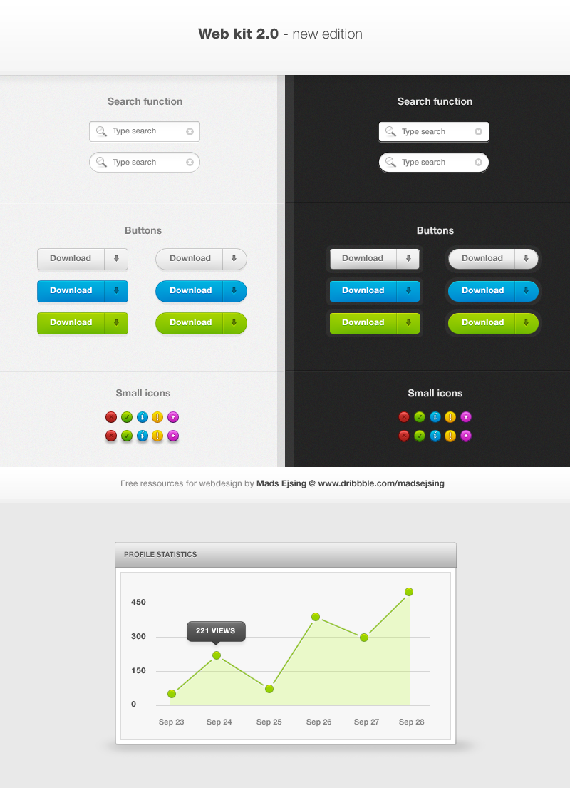
A layout for a customer of mine.Might be updated.
Cheers.
 (Smile)")
Related content


Comments: 40


Not possible - was made for a client.
👍: 0 ⏩: 0

Instead of User: Pixfreak, make it like By: Pixfreak. It will allow for more space in the username.
Otherwise, nice layout, nice colors
👍: 0 ⏩: 1

I want a design like this too, are you able to do?
Or is this one download able?
👍: 0 ⏩: 1
Okay, but could you make one for me a image hosting layout? I'll buy
👍: 0 ⏩: 1
Sorry, I am extremely busy at the moment - and I don't want to do something similar.
👍: 0 ⏩: 1
okay, do not do something similiar, but just something that should fit for a image hosting.
I've been checking for image hosting and like all looks the same. I made a image hosting with very nice features.
Features:
Public/Private Image (Can change if logged example: if is private can change to public)
Account Management
Edit Image (If logged in)
Search for images(Original image names saves in db)
Browsing image (Seeing the latest 1000 images or something)
Multiple Upload system only if is logged in.
....More coming.
Would be better if we could talk in MSN, I have added you with the one M.ejsing.....
When you got time I would really like to buy one from you as I see many nice layouts from you.
👍: 0 ⏩: 0


nice design, very soft and easy on the eyes. I like the blues you used they are placed perfectly. And that upload button is a dream.
I just wish the top menu bar had some more depth and a better showing of what page your on, I think the little arrow doesn't fit the "puffy" "fluffy" "dreamy" "cloud-like" feel you went with. The little pixel arrow just falls too hard on the softness of the rest.
Besides that I think its awesome and definitely would attract me to the site.
👍: 0 ⏩: 1
Hehe, thank you very much for the comment. I actually made an updated version with a new menu approach.
So I know what you mean.
Thanks. :
 (Wink)")
👍: 0 ⏩: 0

This layout is a mix of elengance and professionality. An other wonderful job
")
👍: 0 ⏩: 1

just awesome layout. What the name of font (browse, upload) ?

👍: 0 ⏩: 1
Thank you.
It's called "NeoSans"
👍: 0 ⏩: 1


LOL how many people has this guy gone through.
Hes a guy on msn who's topless right?
I did a little bit of design for him then he kept sending me shit stuff telling me he wanted it like so and so.
I like what you've done, the irony is its nothing how he said he wanted it.
👍: 0 ⏩: 2
Well, I just recieved my first payment - so I really can't complain.
👍: 0 ⏩: 0
I will have to wait to comment on that - but thanks for the heads up.
👍: 0 ⏩: 0


wow! rly awesome! but i cant see the bg texture of the mainbanner... i can see it only in a angle of 20° from the bottom... :/ is this my monitor or whaaaaaat?
👍: 0 ⏩: 1
Well, I don't know lol..
But I am glad you like it!
👍: 0 ⏩: 1

really nice EJ, but for me the bg texture ( pattern etc ) on the main banner .. is not working right with the flow of the layout, maybe its just me
👍: 0 ⏩: 1
Well, it's hardly visible on my monitor, but I can imagine what you mean.
Glad you like it, though.
👍: 0 ⏩: 1
