HOME | DD
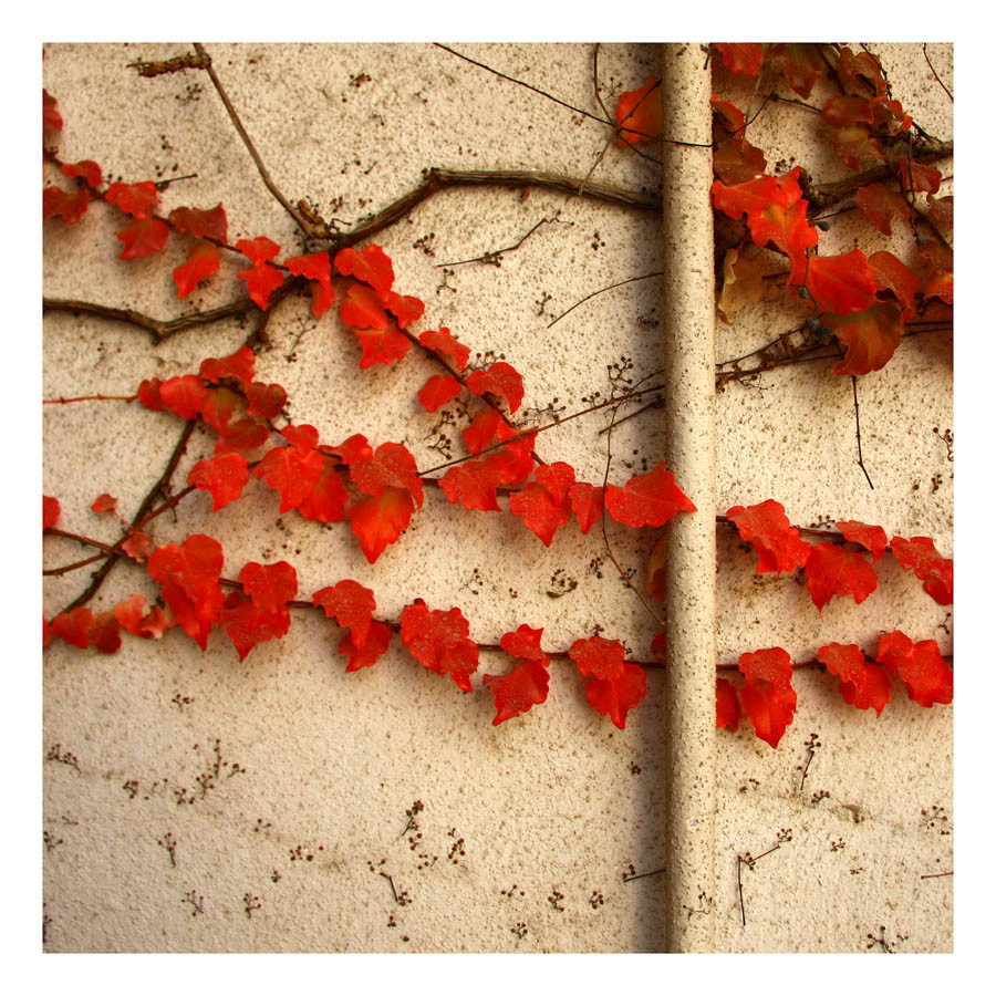
 elementality — red shift

Published: 2004-10-24 04:48:52 +0000 UTC; Views: 45404; Favourites: 1927; Downloads: 5735
Redirect to original
Description
Red ShiftRed ivy envelopes an old tattered wooden fence - shot at late mid-day.
Related content


Comments: 391


I love the colors! This is an absolutely beautiful pic! The contrast is excellent.
👍: 0 ⏩: 0

Red is my favourite color, and you really make it stand out in this photo. Well done
👍: 0 ⏩: 0


I love it. So effective to have the vivid red against the almost monochromatic background bark. The black border is extremely well-used. (In fact, I find this picture looks great on my desktop with a black background) . I really like the delicate veins on the leaves and the mixing of the two textures. Works really well.

👍: 0 ⏩: 0

i have a picture a tiny bit like this! same colors..
beautiful!
👍: 0 ⏩: 0


Beautiful - and like others have said, the contrast in textures is wonderful.
👍: 0 ⏩: 0


i really like it (i bet you ahve heard that a million times)
i love the colouring in the leaves, and how simple and effective the photo is... great job
👍: 0 ⏩: 0

I really liked this piece. The red is so beautiful, and I LOVE it when I see photographers catching the 'mundane'. It's actually always surprising, insightful and well...beautiful.  (Wink)")
👍: 0 ⏩: 0


That's an awesome shot! Gotta start taking pictures like that when I go back home
👍: 0 ⏩: 0


Exquisite. The colour contrasts work bang on target for me, piece composition is beautiful. Really quite knocked back by this shot.
👍: 0 ⏩: 0

very nice colores you have in this shot! the red is really great. the leaves fit quite good to the pales.
so you've choosen a good setting!
but one thing i don' like. that are the green "specks" at the top of the pic. didn't you have a bright lens?? or what is that?
👍: 0 ⏩: 1

Thanks!
The little specks at the top were a result of overexposure, since I was shooting with a crappy little point and shoot.
👍: 0 ⏩: 0

sweet
very lovely colors in this pic ")
")
👍: 0 ⏩: 0


Cool, great contrast between the flowers and the wood. Keepup the great work!
I do shots of flowers and plants too. Check out my gallery.
👍: 0 ⏩: 1
Thank you very much!  (Smile)")
👍: 0 ⏩: 0

well.. it was supposed to cry out of beautiness.. but tears didn't come out
👍: 0 ⏩: 1


What i like best about this photo is the contrast in color saturations.. They're arguably similar hues, both have redish orange and a some purple; but the contrast of the washed out old color and the vibrant living color is very attractive
👍: 0 ⏩: 1
Thanks, im glad you like it!
👍: 0 ⏩: 0

The vibrate red colours contrasting with the dullness of the fence is amazing, love it.
👍: 0 ⏩: 1

Thanks, i might sometime put it up as a print
👍: 0 ⏩: 0

<= Prev | | Next =>