HOME | DD
 emteaART —
sigils v2
by-nc-nd
emteaART —
sigils v2
by-nc-nd

Published: 2006-12-29 23:33:21 +0000 UTC; Views: 50571; Favourites: 2176; Downloads: 0
Redirect to original
Description
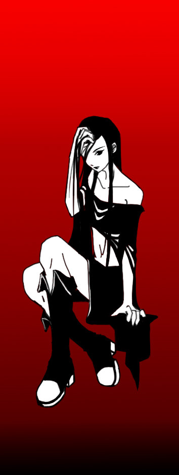
I haven't been doing many black&whites lately, not to mention "typical manga style" drawings.... although this and any other works aren't free from western-comic influences anymore. It's not that I want to get rid of this influence. Because I don't :3I've grown out of "pure anime" thingies a while ago.
It's made in size of a wallpaper, so if anyone thinks it's worth enough to land in his/her desktop for a while is free to download it (but use it as wallpaper only, please
 (Smile)") ).
). You can even download it in higher resolution:
 www.wonderland.pl/tee/sigils16…
 There's also a lineart for this in Scraps, so if you are looking for something simple to practise your coloring skills, then you're free to have a try^^

********************************************************************************
Photoshop CS + Wacom Intuos
Related content


Comments: 427


wyglada niebo lepiej
ten akcent w postaci motylka dodatkowo podkreśla feeling
")
👍: 0 ⏩: 1


I Szczesliwego Nowego Roku zycze

👍: 0 ⏩: 1

Ohhhh Juste Wouhaaa! I love it !!!!! Very AWESOME job!

👍: 0 ⏩: 1

You're very welcome and happy new years!!  (Wink)")
👍: 0 ⏩: 1


omg that's awesome!! 
👍: 0 ⏩: 1

Hi
I must admit I like this one better thn the "red" one. Maybe if you desaturated a bit the red in the shirt in the "red" version, it would be better
Anyway, I'm already using this as a wallpaper
Yiannis
👍: 0 ⏩: 1
Heheh, this red has been even brighter in the beggining
Thanks
👍: 0 ⏩: 0

this version is better - and I must admit it looks amazing. I love the way you draw body and shirt ...

👍: 0 ⏩: 1

AWESOME!! I just loooove the eyes!!
👍: 0 ⏩: 1

Wow, she's a beauty. Enchanting. Great lines you got there, very smooth and dynamic. A job well done!
👍: 0 ⏩: 1


Definatly an improvment ( '-')b I love that you did it in black and white. It make the picture so sexy X3
👍: 0 ⏩: 1

In regards to your question, I think that this version that you have posted here is better of the two (red v. non-red) as the one with the red makes the shirt pop too much and automatically draws your eyes there, as well as making people's (meaning mine. 
~Kay
👍: 0 ⏩: 0

O_O
*button mashes download button*
👍: 0 ⏩: 1
<= Prev |