HOME | DD
 epidemic —
end the fall layout
epidemic —
end the fall layout
Published: 2004-01-25 06:47:56 +0000 UTC; Views: 29271; Favourites: 317; Downloads: 3493
Redirect to original
Description
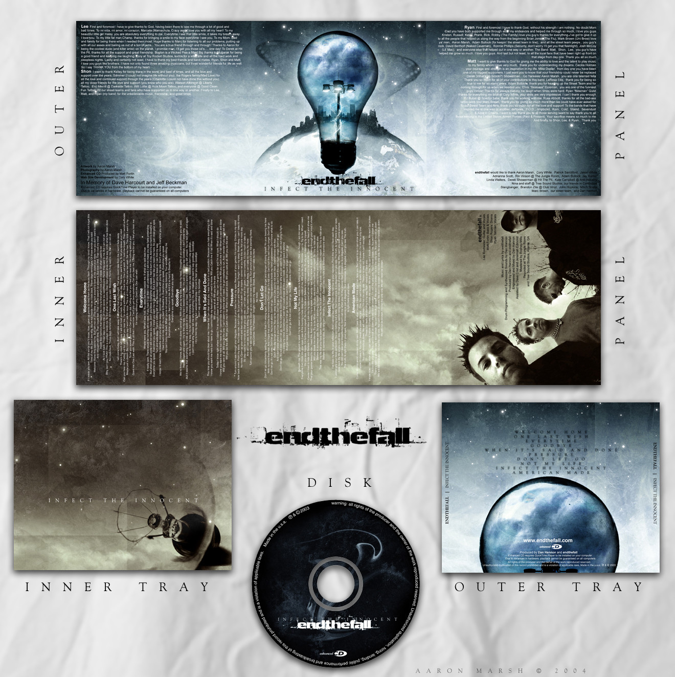
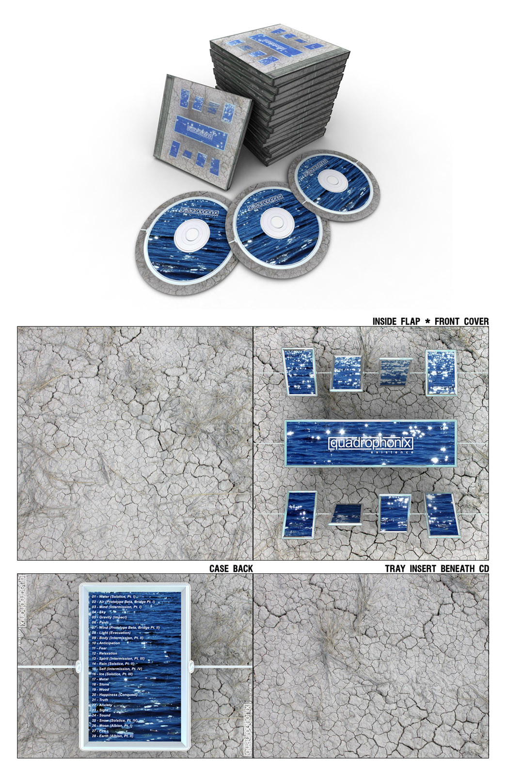
here's an overview of the album layout.. i hope it looks alright.Related content


Comments: 95


")


Very nice, I really like the subtle glow on the titles on the back cover. That effect would have been really cool throughout, nevertheless, still a stunning layout.
👍: 0 ⏩: 0

good job... I really like it... im working on my band's cd cover but it doesent look as good as this one...
👍: 0 ⏩: 0


To comment on 's post, the disk is a logical complement to the print design. What I see is the smoke of a broken bulb gone POOF! Well matched!
I do agree on the length of the sentences, they're a bit too long.
Nonetheless, excellent design and colors.
👍: 0 ⏩: 0

hej dude. nice concept, but why has the disk an other design?
")
👍: 0 ⏩: 0


great work!
I like folded booklets, thet have a different perspective, and you did a great job here!
👍: 0 ⏩: 0


Sentences on the panels a bit too long for my taste, but otherwise it r0x0r your b0x0r
I love the way you've used the picture on the inner panel.
 (Wink)")
👍: 0 ⏩: 0


This is really slick, i particularly like the inner tray and the outer panel.
What gave you the inspiration for the design and concepts? did the band approach you with some ideas or did you come up with something for them on your own?
👍: 0 ⏩: 0


It doesn't look alright. It looks fantastic. I am really impressed with what you did here, very powerful, stylish and also consistent. I like it very much!
👍: 0 ⏩: 0

Dude, what band is that for?! Hook me up! I love it. <3
👍: 0 ⏩: 0


Wow, this is incredible. Now I want to form a band just so I can try to con you into doing our album art! Haha
The outer panel is probably the coolest part of this. Definitely a favorite.
👍: 0 ⏩: 0


this is just sweet. sweet! i love it, the lightbulb is genius, the textures are heavenly, everything is amazing.
👍: 0 ⏩: 0


Superb work ...!!! Everything is perfect ...!!!!
Well done ....
👍: 0 ⏩: 0

really really good concept, and perfect realisation  (Smile)")
👍: 0 ⏩: 0


man, that is some great design. i cna tell ya right now that i would probly buy the CD and i dont even know what genre it is or anything about the band
👍: 0 ⏩: 0

so where can we hear the music that i can only assume accompanies this artwork?
👍: 0 ⏩: 0

Awesome layout! Very lively and interesting to look at. I'd definitely pick it up and at least give it a glance if I was at a music store.
👍: 0 ⏩: 0

This is good!!! *_* Never thought a lightbulb could be so interesting
👍: 0 ⏩: 0


Wow! It's an awesome work, I love the colors and the design.
👍: 0 ⏩: 0


AWESOME design, man i love how all the pages and the cd label work together.....nicely done
👍: 0 ⏩: 0


Fuck that's sweet.
very well done..
enjoy your DD
👍: 0 ⏩: 0


Alright, my arse!
Professional, that's what it is!


👍: 0 ⏩: 0
| Next =>