HOME | DD
 ericfoo — Thron Fighter 01

Published: 2004-10-25 10:03:58 +0000 UTC; Views: 638; Favourites: 6; Downloads: 117
Redirect to original
Description
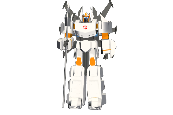
This is a practice took me 30 minutes, all done in Marker as well as artline 0.2.Related content


Comments: 6

waaa.. never thought warm grey can looks so nice. wat colour is the purple? it looks so nicee with warm grey. Sir y never show us this demo!! don kiamsiap la
👍: 0 ⏩: 0

wow... long time no new works man...... u should spend more time doin this kinda stuff.. build ur portfolio.hahahahahhahahahahahahahahaha. I think rendering is great... no doubts. But design, uh....... i think its different from the ususal stuffs we often see.... but i still think can improve.. keep it up.hahahahahahahahhahahaahhaahahah...... take care my 'Si Foo'..........ruahahahhahahahahahhahahah a. 
👍: 0 ⏩: 0


Been some time since you posted stuff here, sir~
The smoke element is rendered nicely, but like what ~KazeNoNe said, it didn't really fit in. Maybe there should be smoke on the other side of the exhaust too? Or perhaps the design was mean to have a single exhaust...
The shadow zone of the grill lines between the two needle-sharp weapons might need some more toning since there's light coming from the foreground~
Tis' a cool piece of work, sir, hope to see more stuff soon!
 (Smile)")

👍: 0 ⏩: 0

Sir, I still like monochrome markers compared to colour because it's harder to control the overall progress. I'll try to practice more on my markers. By the way, I'm the first to comment on this piece.
As usual, wahhhhh. I like the colour. 
👍: 0 ⏩: 0
