HOME | DD
 ExiledProphet — synthesization

Published: 2005-09-28 22:33:29 +0000 UTC; Views: 281; Favourites: 2; Downloads: 29
Redirect to original
Description
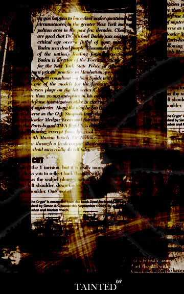
OK, I really don't care what MOST of you assholes think because most of the comments I get recently (the ones I DO GET) because 1 out of maybe 10 are helpful. So if you are thinking of even posting, "what is it", or "I dont feel it", stop where you are and dont even type it.I am leaving comments on though.
I really like this one alot because I invisioned the end point of this piece EXACTLY the way it ended up.
Illustrator CS2 >> for the majority
Photoshop 7.0 >> for colorization, text and minor touchups
Any GOOD C&C or
 's are appreciated tremendously.
--+== Full View Recommended ==+--
-eNjOi
Related content


Comments: 8

i'd remove the render, it doens't add anything to the piece, and i'd soften down the smudges, give them a blur or thin them out (select them, contract the selection, invert selection and delete it), they're too chunky i think. i love the colors/general tone though, and i think contrast (tone suggests soft, but you get quite a hard picture) makes it perfect  (Smile)")

👍: 0 ⏩: 0

its all really well blending, flawless, i love the really softness over the background contrasted with that hardness of the of the darkparts
👍: 0 ⏩: 0

It's not bad but ur deviation comment is really disapointing. Maybe u re not enougth long on DA to know how it works here. Basicaly u don't receive almost any comments to improve ur art (don't talking about u but about us all). Its sad but exactly how it works. Actualy only top artists got serious feedback (paradoxly when they don't need it). So stay nice because what u give that u get. Cheers m8.
👍: 0 ⏩: 0


Well, the guy above does have a slight point of 'messy filters' but FUCK HIM! I like it. I could see this hanging up some like some buisness womens office ")
👍: 0 ⏩: 0

"im not feeling it.." but i'll give you reasons as to why. I dont think the color scheme matches the theme you chose for it at all.. the color scheme would suggest something soft and bright, while the piece itself has patches of like, messy filters. the perspective seems very weird to me, in osme parts its too blurry and others to sharp..and then theres just a hidden render in there with a brushstroke over it..
👍: 0 ⏩: 0


Man I really like the colors! this is something new and refreshing from what others do.
👍: 0 ⏩: 0