HOME | DD
 firebirdmaximus — Power Rangers Science Strike
Published: 2009-05-27 07:54:02 +0000 UTC; Views: 5147; Favourites: 39; Downloads: 93
Redirect to original
Description
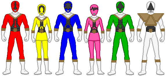
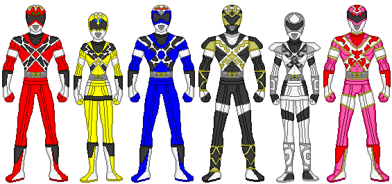
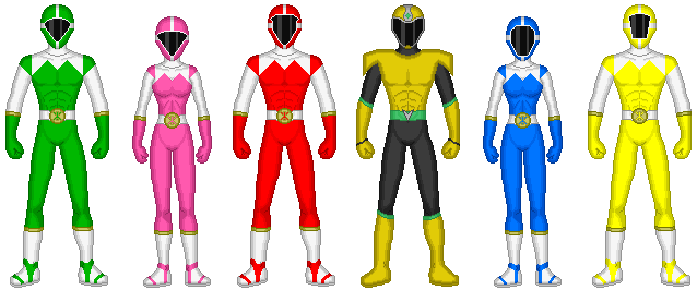
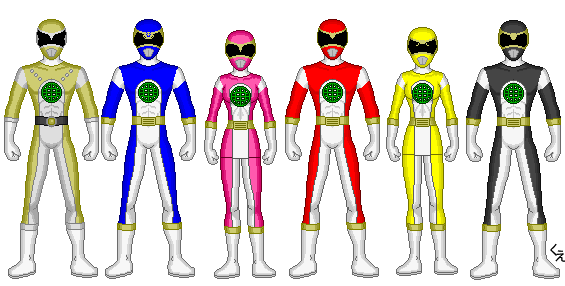
This an original science-themed Power Ranger team I created using Acatl's Power Rangers suit creation template.The individual themes for each ranger are; temperature (Red), magnetism (yellow), something to do with atoms (blue), radio waves (pink), nature (Green) and Light (Prism Ranger).
Related content


Comments: 6

nobody is gonna comment about red ranger's visor
👍: 0 ⏩: 0

Might as well talk about these since I did give my thoughts on your Prism Force designs so here we go. Once again, the suits themselves are very nice and unique with some elements that remind me of Zeo and a few other series.... unfortunately, the suits are still ruined by the helmet designs and unlike last time where I just mentioned the worst helmets, I'm going through all of the rangers from best to worst in terms of design:
Green has the least amount of issues as the visor looks nice with the only real issue being the incredibly tiny mouthplate so there is not much to say about him.
Prism Ranger has a bland design, a functional design but still is quite bland due to the fact that it really just feels like there is no real element that catches the eyes because of its general over-reliance on basic shapes.
Blue is.... a tough one for me. On one hand, it is cool how the visor resembles the shape of an atom but on the other hand, the visor just looks mushy and far too rounded so overall, it's a weak design but passable.
Yellow's helmet is badly designed, the mouthplate is far too tiny and distracting which is a problem that the other rangers share and the visor is just plain stupid as the magnet shape just looks way too thin for anyone to see out of.
Pink's helmet is quite ugly, while it does look functional, the squiggly line that's being passed off as a visor looks stupid and asthetically unattractive.
Red's helmet is arguably one of the worst ranger helmets that I have ever seen, the visor is FAR too thin and the thermometer design on it once again takes the "uniqueness over visibility" route that the Prism Rangers took.
Overall, these ranger suits are once again decent but the helmets once again kill the design.
👍: 0 ⏩: 0

Nice, but I'd rethink the visors. They need to be able to see through them.
👍: 0 ⏩: 0


The red ranger viser looks to small, and hard to see through.
👍: 0 ⏩: 0

")