HOME | DD
 floptical-bob — Rabia
Published: 2001-05-26 21:16:11 +0000 UTC; Views: 286; Favourites: 1; Downloads: 77
Redirect to original
Description
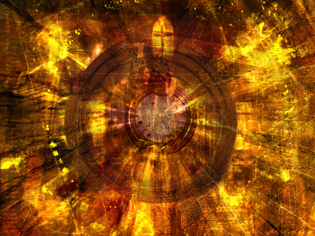
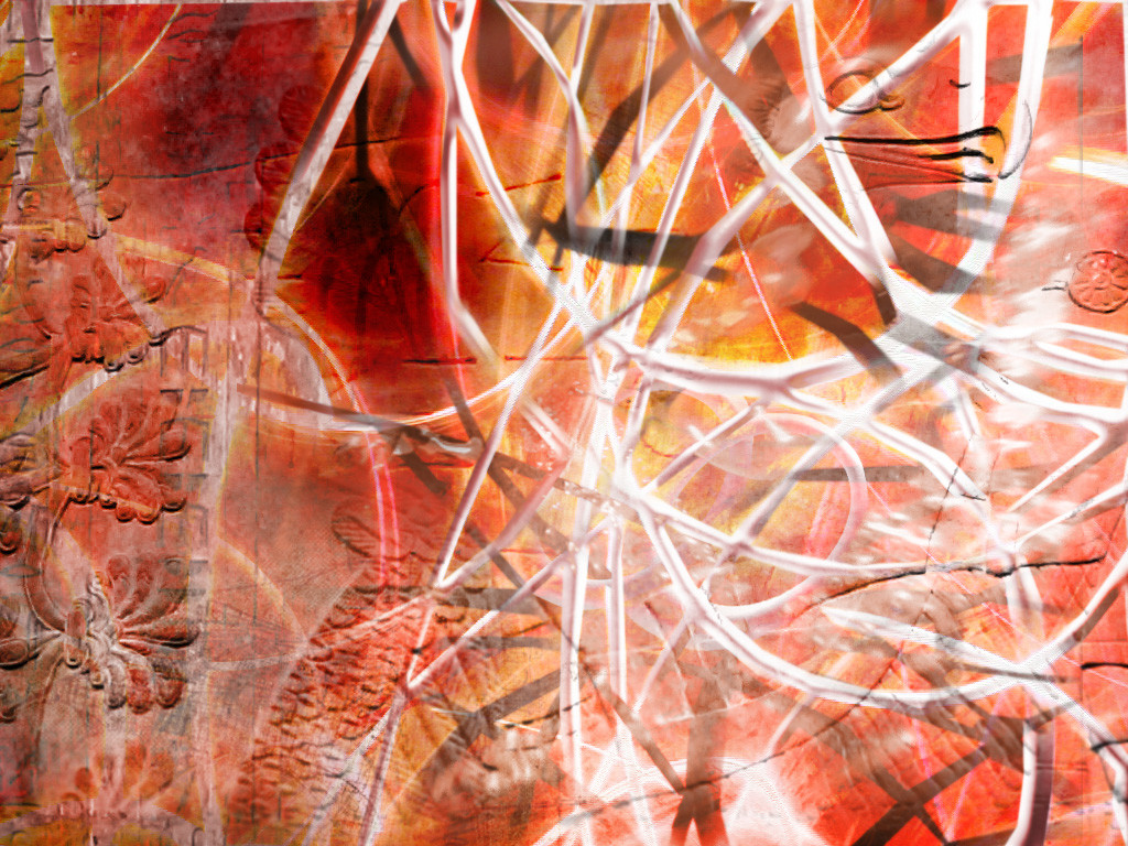
hey..made this is about an hour..i think its pretty cool..but you prolly all think it is terrible...i understand..but i want some comments....one word sums this up...informitivity!Related content


Comments: 9


hm....like it, nice colours, kinda busy though...
-------------------------------
By three methods we may learn wisdom: First, by reflection, which is noblest; Second, by imitation, which is easiest; and third by experience, which is the bitterest. Confucius
👍: 0 ⏩: 0

thank you al0ot..i was playing around with it afterwards...and it turned out better..maybe ill make a v2.0
thank you alot,
Floptical Bob
👍: 0 ⏩: 0

this one is nice, looks like some kind of burning indian sketch for me. the fire-effect (or the coloring is nice)
👍: 0 ⏩: 0

good colors, nice scan lines, it flows nicely together, i like the cross at the top. Pretty kool.
====
Azrael
👍: 0 ⏩: 0

nice! cool cool! i like the colors... i agree with polaris... try not to have it centerd... it would be even better!
btw, that's very good!
[ slåve . 2 . råve ]
-= Voyage Into Trance =-
👍: 0 ⏩: 0

Far from it. I love it. Especially the religious symbol faded in the middle. Looks like a church on acid. Very cool.
________________________
http://www.metadream.com
👍: 0 ⏩: 0

I think the scan lines gave it a nice effect. It's pretty nice. Nice choice in the colors too.
👍: 0 ⏩: 0

Nice stuff man, not to original thou...but u have good technique. Might want to try not having it centered, throw the main circle in a corner or something? gj
👍: 0 ⏩: 0