HOME | DD
 fragdude2k — Hearts and Crafts v2 aka Love
Published: 2003-04-02 01:27:50 +0000 UTC; Views: 121; Favourites: 0; Downloads: 8
Redirect to original
Description
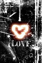
This is another version of "Hearts and Crafts." I wasn't going to post it but, I did.Related content


Comments: 10

I think this is one of your bests! the only think that I don't like so much about this is the size, but did read the reason why, so, it's ok
👍: 0 ⏩: 0


I like it!! I love the way the heart stands out so much!! And I love the background!
👍: 0 ⏩: 0
I Like it!! The heart really stands out and I love the background!!!
👍: 0 ⏩: 0

The reason that it is so small is because, I didn't think I would want it bigger, now I do. It was just a experiment. I was trying to make a heart with "
👍: 0 ⏩: 0

I like the design, but why so small? The neon is really effective against the black.
👍: 0 ⏩: 0


Whee...that really reminds me of one of my M. Prints. I like eet.
👍: 0 ⏩: 0

Wow thats really cool, it would make an awesome poster, or t-shirt design, I love the grungyness and textured effect, as well as the blurring and contrasts of all the seperate pieces in it.
Great work!
👍: 0 ⏩: 0

I don't know why the size would be so small, but I love the grunge design. The heart in the center definitely blends in well with the image given the contrast difference. Very nice job !
👍: 0 ⏩: 0