HOME | DD
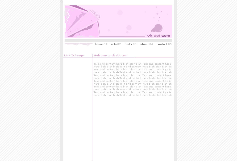
 froob — vk dot com latest layout
Published: 2002-10-18 16:19:21 +0000 UTC; Views: 1301; Favourites: 0; Downloads: 59
Redirect to original
Description
The url is actually veakay dot com not vk, but vk looks betteruummm, my host is currently down, but when its up, ill put this lil design up.
I just wanted something simple and easy to use.
C & C welcome
Related content


Comments: 8


Ooh, I like this. Very pastel. Very minimalistic. Very cool.
👍: 0 ⏩: 0

i seriously like this layout..simple but secksi ..it does it's job well..wish i wouldda thought of a design like this
👍: 0 ⏩: 0

Its a tad bit bright, and a little to less contrast.
👍: 0 ⏩: 0


I can't find anything I think is particularly strong about this one. The pallette is muted with little contrast but I realize that may be the look you are trying for. Conceptually, It doesn't give me much either in balance, line, movement, emotion, etc. However, there is something to said for building an art site that is intentionally subdued so that it does not distract from the art it contains.
The page layout itself is not bad. The copy seems a little cluttered but that will probably correct itself when you get your actual text in there. I think you just need to push that banner image a bit more.
Can't wait to see the finished product, keep up the work!
👍: 0 ⏩: 0

Good choice of color and the banner goes great with the rest of the site.
👍: 0 ⏩: 0
