HOME | DD
 fujin — Alphanumeric 2

Published: 2001-11-08 20:51:33 +0000 UTC; Views: 430; Favourites: 4; Downloads: 99
Redirect to original
Description
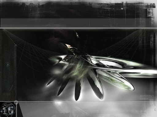
This is a wallpaper based on my site but v2... Well im not even sure if 2.0 will come out any time soon but what's the point of keeping this wall o well ill make a new one when it comes out so this is just a wall I guess.Related content
Comments: 7

Hm I kind of though of that area to make it for the icons, but I see what you mean it does look like it's missing something.
I will trie to make it not too junked up but leave it a little more in the back then the top so you can put your icons there, ill think of something, thanks for the comments.
-fujin
Alphanumeric//
http://home.earthlink.net/~idisp
👍: 0 ⏩: 0

*purrs* verrrrrry sleek. i'm reminded of crunching an ice cube... you might want to spice up the bottom a bit, but other thatn that this's is great.
::aria::
👍: 0 ⏩: 0

Really good style. but there could more on the buttom. Why did u leave it black?
beneL
👍: 0 ⏩: 0

i like this piece but i thinks u shoulda expanded it to da bottom more.. but like.. i dunno maybe that's space for da icons and winamp.. cuz i hate having winamp all minimized and i hate covering up a nice wall.. so maybe thats wut feelz like.. heh.. big o comment that basically sez .. nice job.. hehe
eks...
GA http://www.awedigi.com/ga
👍: 0 ⏩: 0

what is this crap? you call this something? bleh. nasty yucky you suck
👍: 0 ⏩: 0

Oooh the trendyness is killing me But it`s well done.. not too over-used colors either! I wish this was in a higher resolution
Good work!
:frown: rock on
👍: 0 ⏩: 0


