HOME | DD
 G-netix04 — Helvetica II
Published: 2009-05-26 08:01:40 +0000 UTC; Views: 541; Favourites: 3; Downloads: 0
Redirect to original
Description
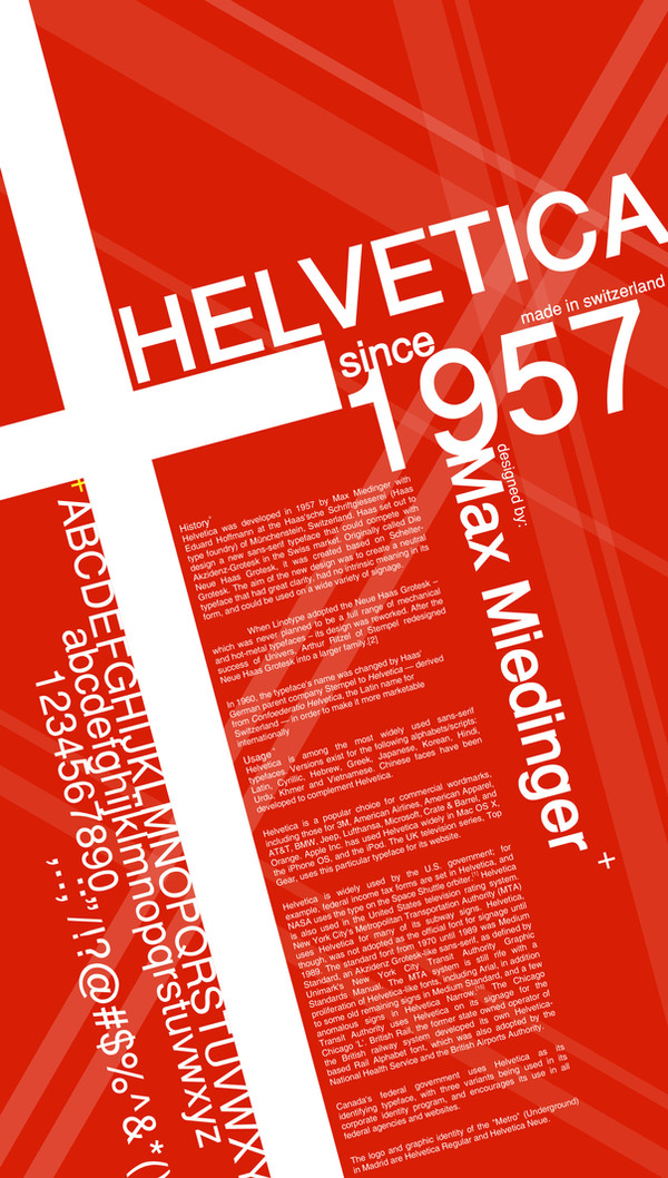
HistoryHelvetica was developed in 1957 by Max Miedinger with Eduard Hoffmann at the Haas'sche Schriftgiesserei (Haas type foundry) of Münchenstein, Switzerland. Haas set out to design a new sans-serif typeface that could compete with Akzidenz-Grotesk in the Swiss market. Originally called Die Neue Haas Grotesk, it was created based on Schelter-Grotesk. The aim of the new design was to create a neutral typeface that had great clarity, had no intrinsic meaning in its form, and could be used on a wide variety of signage.
When Linotype adopted the Neue Haas Grotesk – which was never planned to be a full range of mechanical and hot-metal typefaces – its design was reworked. After the success of Univers, Arthur Ritzel of Stempel redesigned Neue Haas Grotesk into a larger family.
In 1960, the typeface's name was changed by Haas' German parent company Stempel to Helvetica — derived from Confoederatio Helvetica, the Latin name for Switzerland — in order to make it more marketable internationally.
hehe..bored again so...another lay-out practice

master Ivan thought me how to do the "reflection" thingie...(damn im so innocent)...*lol*
hope you like it...enjoi!!
")
Helvetica kicks Ass!!!

://practice...practice...bored bored...ZZZzzz(-_-)...
://photoshop + illustrator