HOME | DD
 garet-jax — Ampburner - Phoenix v1.10
Published: 2003-10-03 05:11:24 +0000 UTC; Views: 1410; Favourites: 9; Downloads: 1152
Redirect to original
Description
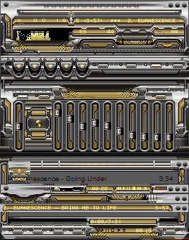
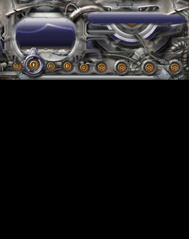
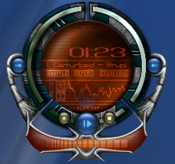
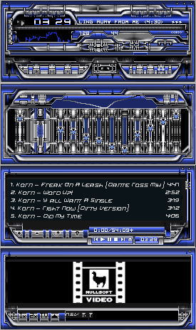
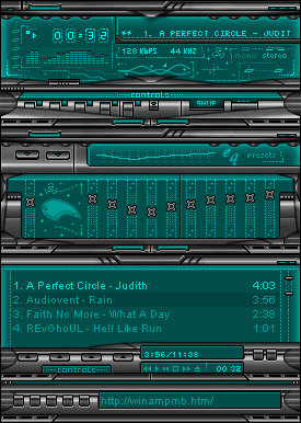
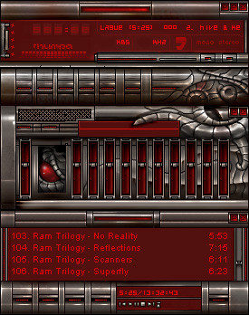
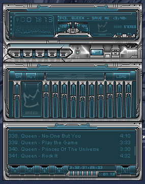
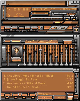
A tribute to a friend of mine...I made it to reflect what I thought he would of done if he continued to skin.q-I made an update to the playlist and the equalizer to include some areas, that I missed...sigh. Sorry, but, sometimes when you are doing these things you miss something...(i did anyways).
Related content


Comments: 15


 (Smile)")


A little busy for my liking, but still a great skin. Excellent Work.
👍: 0 ⏩: 0

Its true this skin is a first for me of not labeling...but, this was deliberate...I developed the skin as an advanced skin...those that are most familiar to winamp know the placement and things they need. So, I chose to keep it in the advanced perspective and not ruin the aesthetics of the design by tacking on crappy button labels.
-gj
👍: 0 ⏩: 0

It's a cool design but I don't like that the buttons aren't marked according to what they do.
👍: 0 ⏩: 0


Notice: Many of my skins (in the final phases can be downloaded from fewgroup.com along with a great deal of very wonderful skins, pictures and wallpapers.
[link]
Come See whats next.
👍: 0 ⏩: 0

me remembers ampburner. nice skin here good work, could tell it was you who made it from the thumb
 (Wink)")
👍: 0 ⏩: 0

Looks very nice. I agree that the text color on the pl seems a bit off, but I like everything else, from the layout of the buttons to the colors you used. Very slick
👍: 0 ⏩: 0


Nice colors and great detail. I really like the cbuttons.
👍: 0 ⏩: 0

Good job. I wanted a good mixed metal skin and now I have one.
👍: 0 ⏩: 0

This is a pretty nice skin...everything in the main windows (Main, EQ, Playlist) is pretty well done. I love the buttons ^_^ However, the font colour you chose for the Playlist (the pink/copper colour) doesn't match too well with the rest of the skin...also, the font colour in the Library is too close to the background gray colour (I can't read the text). Besides those things, the skin is great

👍: 0 ⏩: 0

Wow.. funky detail! But it seems slightly incoherent to me... I saw this on the front page, what timing!... mhmm.. time to watch you
👍: 0 ⏩: 0