HOME | DD
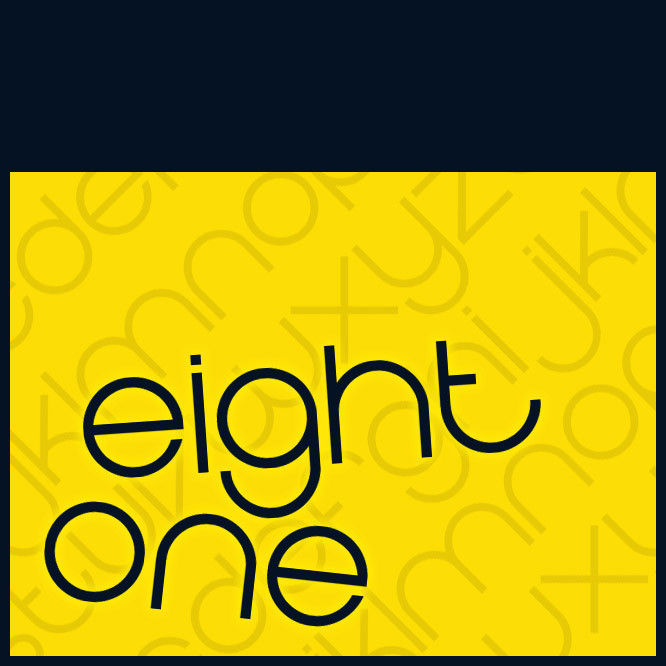
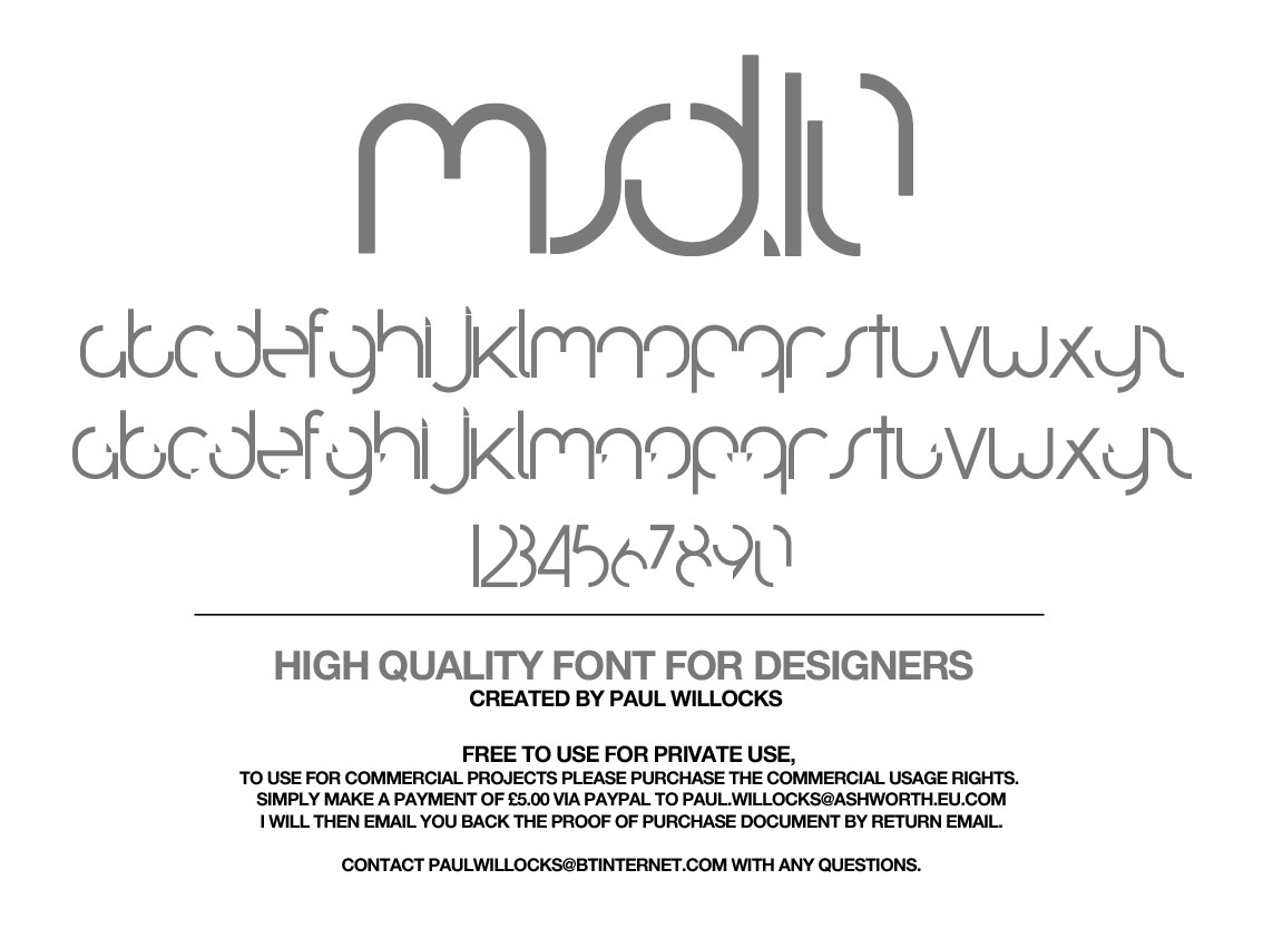
 glue — Eight One
by-nd
glue — Eight One
by-nd
Published: 2006-12-23 04:42:12 +0000 UTC; Views: 454195; Favourites: 1067; Downloads: 267693
Redirect to original
Description
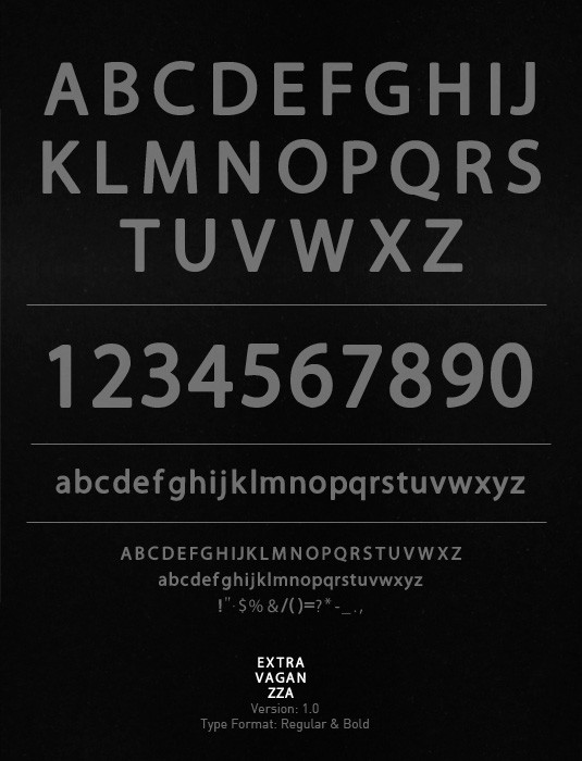
You are downloading Eight One Regular. This is a True Type Font with limited character support, strictly for demonstration purposes. The font is a work in progress, meaning this deviation will be updated from time to time.Update:
Final update to this font's character support... unless I find a good reason otherwise.
CCPL: Attribution-No Derivative Works 3.0 Unported
Related content


Comments: 189


 (Wink)")

Can I use this font for a "to be" corporate logo for a social networking site? It's going to take at least another year to get it off of the ground.
👍: 0 ⏩: 1

Go right ahead. Thanks for asking.
 (Smile)")
👍: 0 ⏩: 1

really nice font, I think you should include all characters and release it as open type font!
👍: 0 ⏩: 0

this font is nice, I don't think the S goes well though.
👍: 0 ⏩: 1
Yeah, that S does not fit. I still don't like it.
👍: 0 ⏩: 0

your range astounds me sometimes sir.
👍: 0 ⏩: 1


 (Cool)")

beautifull! well done, im designing a new one at the momment, its for reading purposes and i ll make a version, a bit tweaked for advertising
👍: 0 ⏩: 0

i love this font. Use it regularly. Example here:
[link]
👍: 0 ⏩: 0

Very nice font. It's simple and smooth and very consistent in its design. I hope I have a chance to use it soon.

👍: 0 ⏩: 0

awesome man. love to see people playing with font styles, it takes a lot of work. this is good stuff. more?
👍: 0 ⏩: 1
I'm lazy. Maybe. That's really stretching it though...
👍: 0 ⏩: 0

I like this font, except for 2 letters. the J and the Y. They seem to me as if they don't fit perfectly with the rest. But overall you made a good font.
👍: 0 ⏩: 1
I'm unhappy with a few things personally...
👍: 0 ⏩: 0

i used your font in this sig block located here [link]
👍: 0 ⏩: 0


clean and stylish font...
Can you tell me the softwares you used to create your fonts? Thanks
👍: 0 ⏩: 0


nice mate i've been looking out for a font that looks like this and looks like you and i think the same cuz this is exactly what i wanted, so thanks im dl'n it, using it, faving it and show you what i get when i use it
👍: 0 ⏩: 0


Ah nice to see this being updated =] I really love this font style so I definetly download it once again. Great stuff
👍: 0 ⏩: 0


listen glue quit kicking yourself for the simplest things in this font... each letter including the reds look really good. honestly i wouldnt worry about some bs to make them any better... everything is perfection. you have my word.
👍: 0 ⏩: 1
Eh, well, I see things I don't like. I know I am a perfectionist to some extent. Things are going to roll out anyway...
👍: 0 ⏩: 0


Nice font! Hope to see an expanded version soon!
👍: 0 ⏩: 0


Thanks for the suggestions. ")
👍: 0 ⏩: 0
<= Prev |