HOME | DD
 Goombac — Hiccup and Toothless WIP Color Choices
Published: 2014-03-12 15:02:05 +0000 UTC; Views: 5326; Favourites: 139; Downloads: 13
Redirect to original
Description
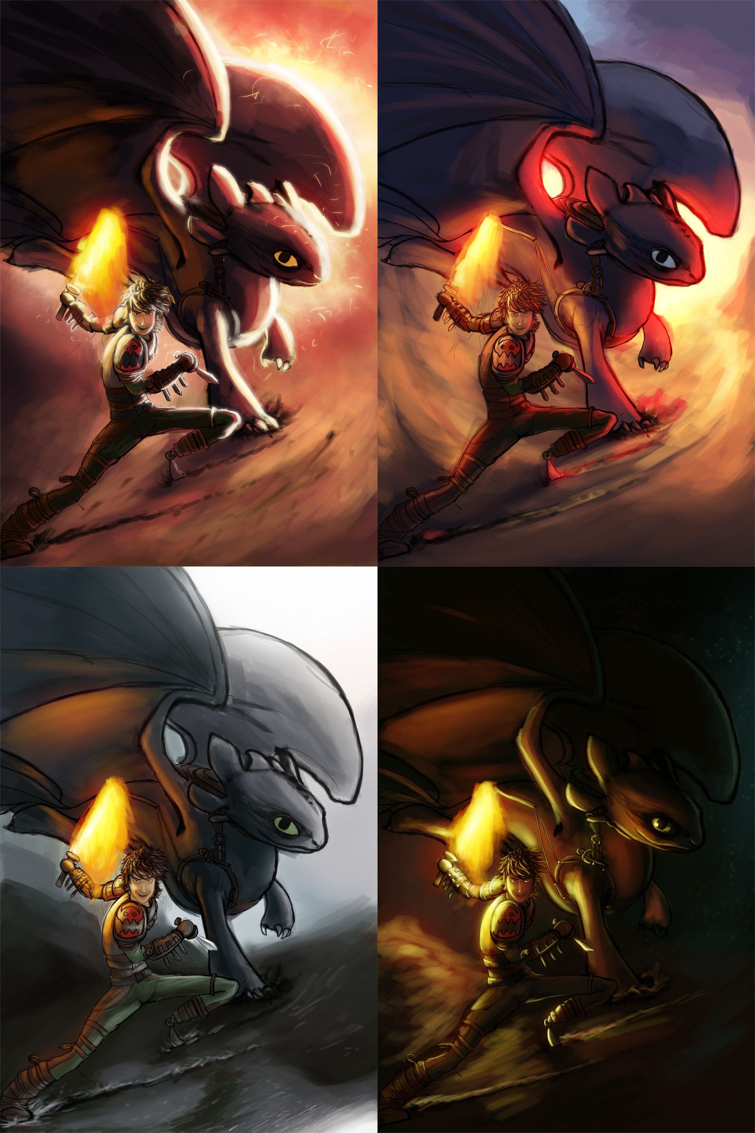
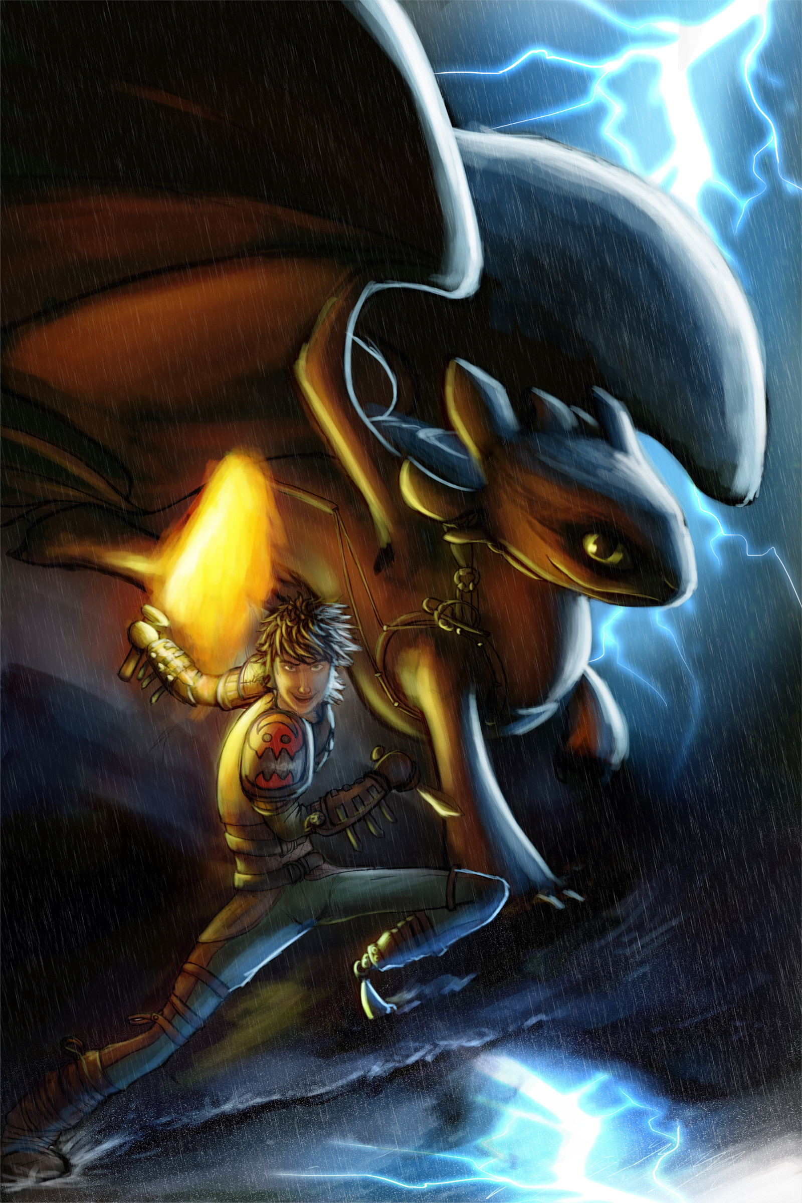
Some color choices I made. Not sure which I like best though. May mix elements of them or just pick one or whatever. May do something completely different. I dunno! Any feedback is appreciated!Related content


Comments: 15

The top-left one is too poorly defined and the flash from the back is distracting. The top-right one is similar to top-left, but it's toned down a bit, so it works. The best quality of this version is the red glow around Toothless from the right. The bottom-left one is defined a bit too well, making everything look faded, which is boring. The bottom-right one looks the coolest because Hiccup's blade is the only source of light, making a whole bunch of cool shadow effects on both figures.
If I had to give any suggestions (top-right and bottom-right are both perfectly fine as they are), I'd say take either the light from bottom-left or the red glow from top-right and slowly add it to bottom-right until you find the perfect balance of cool shadows and actually being able to see the subject.
👍: 0 ⏩: 0

Wow! Love this, last panel is my favorite!!
(Also, is just me or throughout each panel Hiccup and Toothless's expressions look more evil each time? O.O xD)
👍: 0 ⏩: 0

The last one is, by far, the best ^-^
Great job on all of them, though!
👍: 0 ⏩: 0


 (Wink)")


Epic! I would totally use the red one (top right) but then mix it with the contrasting white light on the characters on the top left. THAT would look epic. But I also like the left effects on the sword on the bottom right xD They're all so goood!
👍: 0 ⏩: 0

The one on the top right is super cool-looking! I mean, they're all great, but that one's my personal favorite. Great job!
👍: 0 ⏩: 0


This is very good.
Personnally, I think that a mix with the 2nd and the 3rd could be nice. I find the last one too dark ^^
Great work though ")

👍: 0 ⏩: 0