HOME | DD
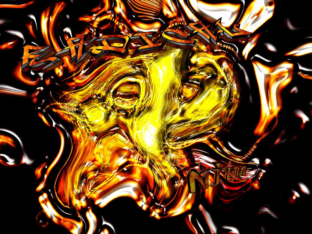
 goonsquad — Team RADICAL - NITRO
Published: 2001-11-07 20:38:57 +0000 UTC; Views: 349; Favourites: 2; Downloads: 46
Redirect to original
Description
i made this for my friend nitro, it's just the team radical wallpaper i made with nitro added to it. enjoyRelated content


Comments: 6

Life is complicated
very nice! Sorry, but I like this one alot better than your latter one. The text is cool, however, nitro kind of disapears a little too soon: you cant see the o very well, but it is still an exelent picture, I especially like the colors (orange and red my favorite combo). Keep up the good work.
👍: 0 ⏩: 0

this is very tight too... I actually like the text on this one, you got a cool 3d thing going on with the text... good job man... nice and colorfull
May the force be with you!
-Jedeye459
👍: 0 ⏩: 0

blue thats y its an abstract nice mix of colors and cool chrome type look to it..i like the 3d text u did too..looks really neat..nice job
.·:·.shr00m.latest. https://www.deviantart.com/deviation.php? id=95507.·:·.
👍: 0 ⏩: 0

if u animated this it would look so sweet. i is good anyway
..:: ART|hive http://jamesmusgrave.cjb.net ::.
👍: 0 ⏩: 0

This began looking as an interesting piece, the lurid reds and yellows are nice. But for some reason in the center the whole pice gets kinda blurred and distorted. Maybe you could work on that?. Also the text is kinda lost into the background is hard to read, is it not supposed to be a focal point?.
Personally, i think with a bit of reconsideration this could be really cool. But thats just me.
👍: 0 ⏩: 0

Colorful, yet I can't seem to figure out just what it's supposed to be but cool nonetheless.
~ Masterly! ~
👍: 0 ⏩: 0