HOME | DD
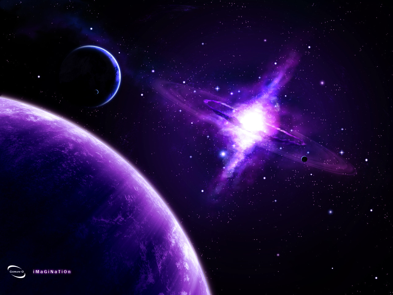
 goran-d — Disunion

Published: 2005-09-02 18:14:53 +0000 UTC; Views: 1733; Favourites: 15; Downloads: 369
Redirect to original
Description
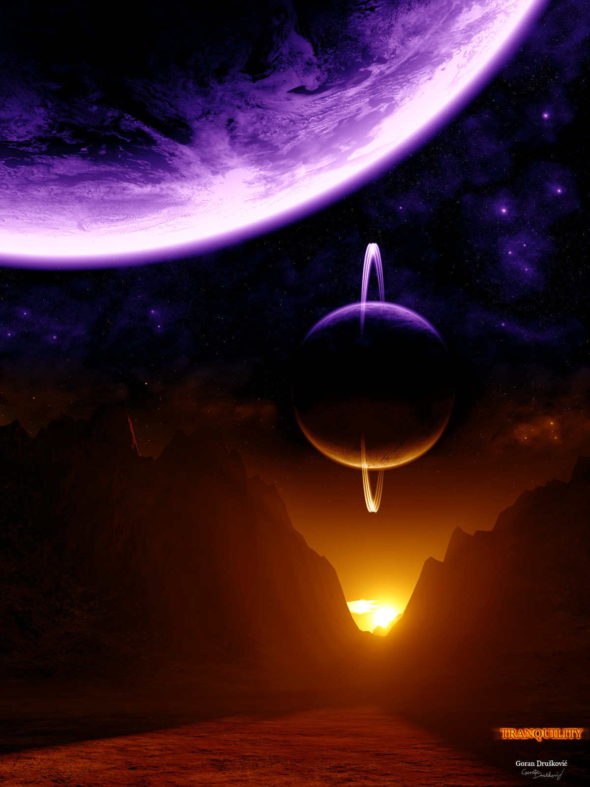
Here`s another sci-fi wallpaper.I made it in Photoshop CS2 and it took about 2 hours ...
hope u like it !
 (Wink)")
comments, crits, favs and watches always appreciated !

Related content


Comments: 15

heh..trebalo bi uz ovu tvoju negdje uploadati i moju..eheh
👍: 0 ⏩: 0

jebote zakon ali dvi ure nema teorije da bi ja duže od 15 minuta radia odma bi odusta XD
👍: 0 ⏩: 0

That's a very interesting two toned theme you have going, the planet seems a bit too embossed though, if you looking at it from a million miles away you won't be able to see the elevation of mountains or craters.
👍: 0 ⏩: 0

the planet reminds me of the Yin-Yang symbol, pretty good...
👍: 0 ⏩: 0


 (Cool)")

I would stay away from the Nasa maps and work on developing your own planet textures. Other than that I the starfield, colours and lighting are looking quite good mate.
👍: 0 ⏩: 0

I think it's very very nice, the colours work excellently together, the texture is interesting & yet simplistic, like that of a large moon, the composition of the piece is excellent and the fade to black is a delicious twist of genius. The minimal but prominent text & logo work well here too, though perhaps on the border they might fare better? Also, the white line on the border could easily be done without, or at least have its opacity lowered so that it doesn't steal focus away from the art.
One last suggestion: the stars in the starfield are nice, and the arrangement is wonderfully random, but they are much too evenly spread. If you arranged them in randomly sized and shaped patches of small stars, large stars, medium stars, large&small stars, meduim&small stars, no stars, few stars, & so on.
A nice job!
👍: 0 ⏩: 0


Very nice love the layout of the planet, very nicely done.
👍: 0 ⏩: 0

 (Smile)")

