HOME | DD
 grahamfx — digitalFURY
Published: 2001-11-07 22:54:24 +0000 UTC; Views: 1102; Favourites: 3; Downloads: 348
Redirect to original
Description
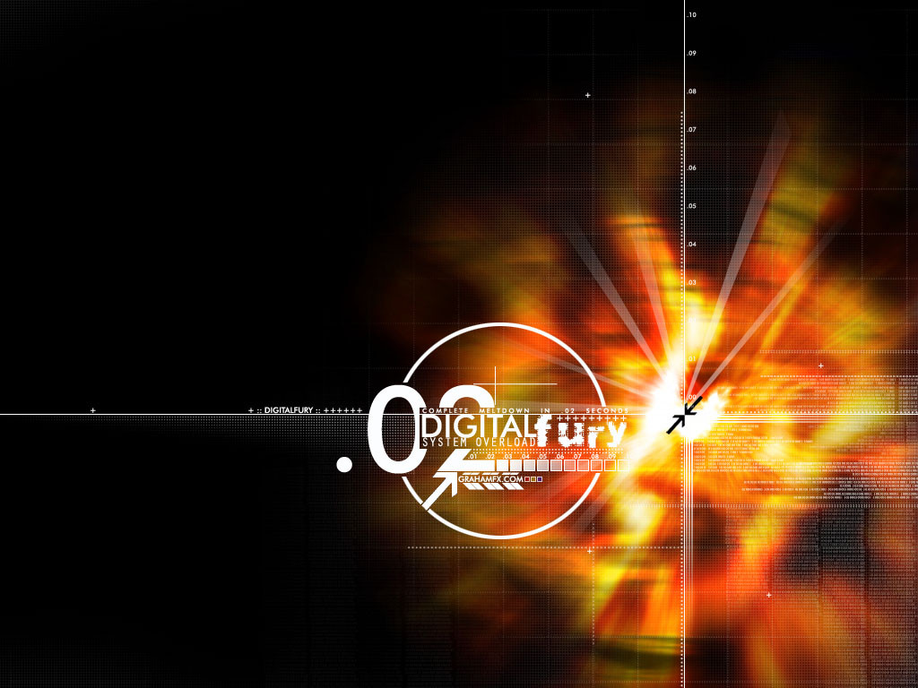
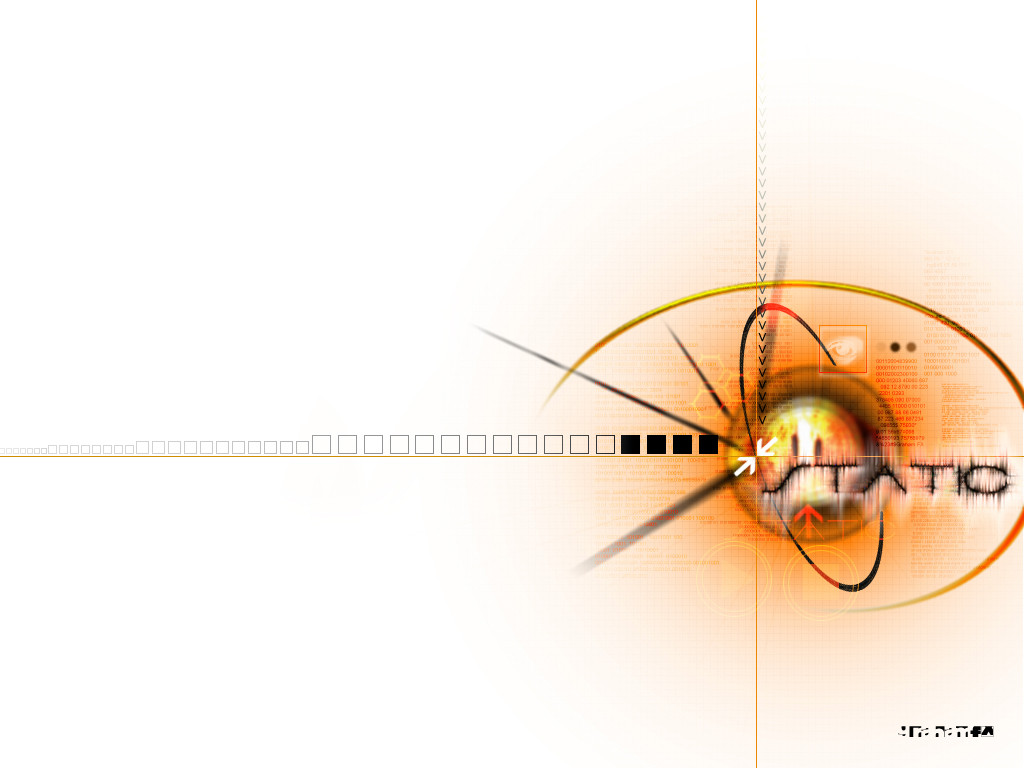
Well, i went for the digital look on this one, then i added some trend. I like what i got, and I think this is my best yet. It took about 3 hours to complete.Program used: Adobe Photoshop 6.0
Comments are welcome
Related content


Comments: 9

what was the original pic.. orange .. ?? or was it?.. great.
👍: 0 ⏩: 0

Wow... I wish I could do stuff like that... damn I suck
-======-
Crazy??? I was crazy once. They locked me in a room. I died in that room, so they buried me in the ground. The cold hard ground, with the rats. I hate rats! They make me crazy!!! Crazy??? I was crazy once. They locked me in a room. I died in that room, so they buried me in the ground. The cold hard ground, with the rats. I hate rats! They make me crazy!!! Crazy??? I was crazy once…
👍: 0 ⏩: 0

I like it, and yet.. I don't.
I like it because of the color usuage, and the "GUI" feel to it.
Then again, it's not an orignal idea by far.
You got the talent to do better I think Trends are not allways a good thing.
Keep up the good work.
--
Kill my boss? Do I dare live the American Dream? - Homer J. Simpson
👍: 0 ⏩: 0


That's good. Thats' very good. I like that style so much. Great work...
Jankin
http://www.jankin.com
👍: 0 ⏩: 0


Nice work, although in the bottom right corner, the text overlays are not needed in my opinion, I'd like to also see the white streaks blended more, but that's just me, great image all around.
.RA
h:tron http://www.hypertron.org
un:realism http://www.unrealism.net
i:industrial http://www.ingen.nu
[a:form]
👍: 0 ⏩: 0


hella-nice..love the bright orange effect u did and all the trendy stuff looks great..very nicely put together and the colors look nice..although the left side seems a lil plain compared to everythign else..maybe add some stuff over there..other than that nice job
.·:·.shr00m.latest. https://www.deviantart.com/deviation.php? id=95507.·:·.
👍: 0 ⏩: 0