HOME | DD
 h16 —
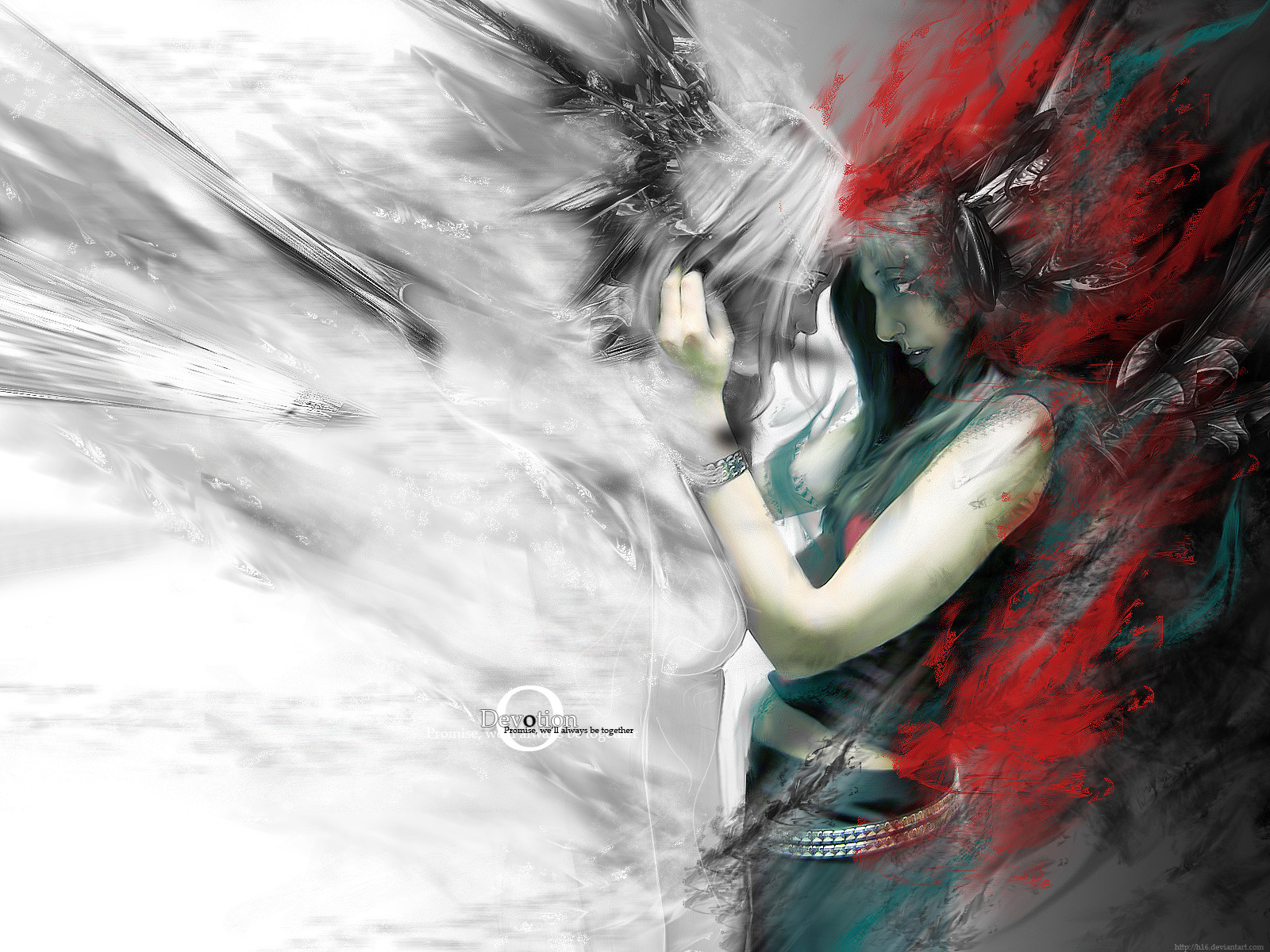
Devotion
h16 —
Devotion
Published: 2005-08-12 21:20:55 +0000 UTC; Views: 128385; Favourites: 1729; Downloads: 28425
Redirect to original
Description
--// No matter where we go, who we become, or when we part. I will forever be devoted to you.10 hours to complete:
Photoshop Mainly with some Cinema4d renders.
Stock Credit to the Amazing *virgin-stock
Comments, Suggestions, and Favs all welcome.
Related content


Comments: 234

Great job. Can't help wondering how it would have turned out if you pushed the reds as much as the whites on the (devil?) red head figure, Like how you didn't cross the line to what could have been an abstract piece.
👍: 0 ⏩: 0

 (Cool)")
 (Smile)")

WOW. This is just ... lovely beyond reason. It's so soft and romantic but quite detailed ...

👍: 0 ⏩: 0

cool!! is there meaning behind this? are they in love or fighting?
👍: 0 ⏩: 1

Concept is Basically said in the description. Basically stating that there in love, and no matter were they are, they will always be devoted to one an another.
Weather it be heaven or hell...
")
👍: 0 ⏩: 0


what is the hell is going on Oo
sexyyyy ^^
wow man...this is really nice, amazing mani


👍: 0 ⏩: 0


Great my new wallpaper
I love how the sides are different from each other yet they blend so well
👍: 0 ⏩: 0


goood shit man! the only thing im not feelin is the chick on the rights, eye. otherwise looking bad ass man.. we still need to collab
👍: 0 ⏩: 1
Thanks bro. Ya I know I got a concept in mind for a collab. ill start on it and send it your way.
👍: 0 ⏩: 0

There's such a powerful expressiveness in the contrast between her eyes and the shadow surrounding her face that's, for me, the strongest focus in this picture...not to mention your sense of such a stable inbalance between the intense darkness of the right side mixed with the almost equally attractive, and dramatic, stark white void on the left. This is, modestly speaking, an excellent piece that, at first glance, I had thought was an original drawing.
*Very impressed*

👍: 0 ⏩: 0

some part of the renders that blended with the model and the way you mixed up the colors make this one look like an oil painting..its beautiful..ya really did blend her nicely into the bg..awesome job !!
👍: 0 ⏩: 0

i'm supprised no one said it reminded them of shadowness. Anyway I think it's awsome and worthy of my +fav.
👍: 0 ⏩: 0

Awesome work, your blending is always very unique and inch perfect. I love the transition between silverish white "colourlessness" then a nice splash of colour.
Excellent job as usual.
👍: 0 ⏩: 0


wow!! ok this is by fay your best..everything fits..the concept is awesome..can't find anything wrong...thats a +fav for sure!
good job bro
 (Wink)")
👍: 0 ⏩: 0

all i can say is, Score.
freaking awesome love the concept and execution.
excellent job grasping the feeling of the image.
+favizm
👍: 0 ⏩: 0

I commented earlier when i first grabbed it, but i was sitting here looking at my destktop and just had to come back and add this thing to my favorites and add you to my watch. Keep it up!
👍: 0 ⏩: 0


This is really deadly! The two persons look like good and evil! lol.
👍: 0 ⏩: 0

The colours are perfect, the meaning good. It's all good.
+fav.
REgards,
David.
👍: 0 ⏩: 0

Very very nice man. I love the way you have two stocks in there, the left one looks great, but the right one looks a bit out of place. The way you blended in so many renders, almost seamlessly, is an achievment, and you made 90% of them look good, just a few look jaggy.. Its just the one above the left girls head, it aint blended well, .The typo is nice and simple, looks clean. The red fractal looks real good and the green really sets it off, great colour choices throughout. What can i say man, this is a brilliant piece, that time paid 'dividends' ha ha
👍: 0 ⏩: 1

I don't think they used two stocks... unless there's something in the picture I'm missing. you mean the two girls, right? [link]
👍: 0 ⏩: 0


I love your wallpapers, very nice editing the picture in, you got a gift for this sort of thing, keep it up
👍: 0 ⏩: 0
this piece is great. It caught my eye right away with the colors, and the detail is just fantastic. I found my new wallpaper
👍: 0 ⏩: 0

like i said on AIM this is one of the best work I've seen from you. Got myself a new wall and +FAV
👍: 0 ⏩: 0

<= Prev |