HOME | DD
 h41i70515 — Restricted
Published: 2001-12-30 21:11:38 +0000 UTC; Views: 1029; Favourites: 4; Downloads: 250
Redirect to original
Description
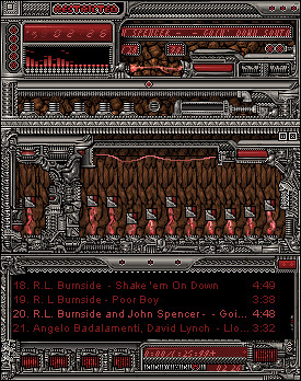
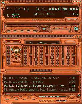
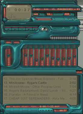
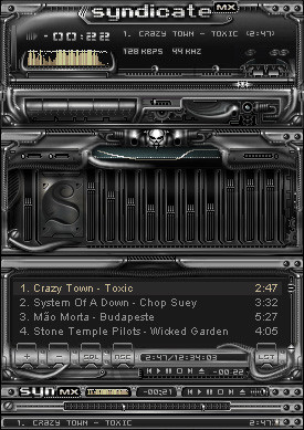
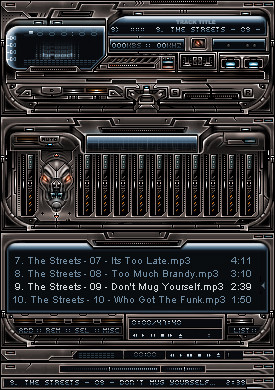
An upgrade to the PG13 style [link].I had nowhere to be these holidays, so this skin helped occupy my time.
I hope it's enjoyed as much as I enjoyed making it.
sorry for the lack of labels for the playpause stop buttons (cbuttons)
it goes like {rewind, play,pause, stop, forward}
ok, check it out,
thanks
peace owt
-halitosis aka Greg Petre
(c)2001 [just barely]
update:
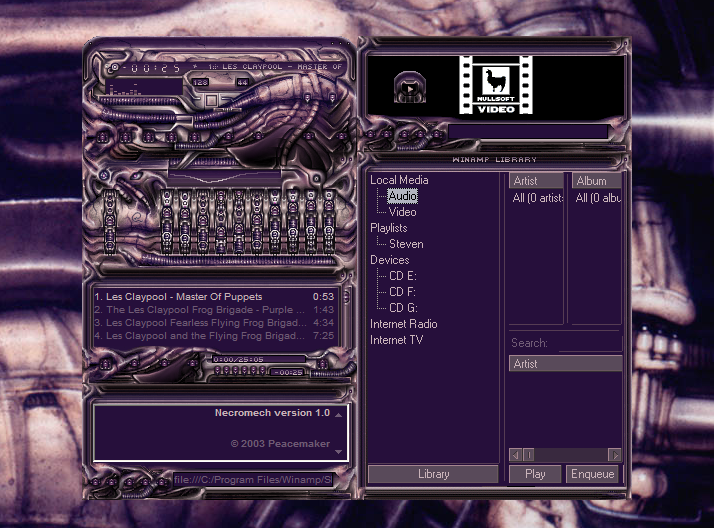
found one file that wasn't indexed, so's I zipped it again and reloaded. don't think it's gonna work though, cuz I had this problem with the lugan amp too....so...I dunno. I can't figure it out. it looks fine here. If you want I could send you the bmps and you could just archive them yerself, maybe that would work. I have no idea.
April 19th:
intolerant set me up with a fixed version.
Apparently none of my skins ever work right
now this should.
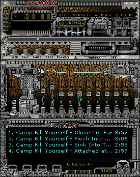
Lugan AMP is next, then maybe I'll backtrack to all the rest
Related content


Comments: 25

Wow, that is awesome! I love the colors and the tiny little details in the texturing on the metal are superb!
-Tsp
A fetish in the hand is worth two in the bush.
👍: 0 ⏩: 0

You have to extract the files and resave them, then zip it up again... thats how i got it to work.
My site: http://mspano.hypermart.net
CSA: http://crazysunart.narod.ru
Drunken Masters: http://drunkenmasters.hypermart.net
👍: 0 ⏩: 0

!WOW! !PERFECT! !FAVOURITE!
::::::::::::::..
::::::::::::::..
::::::::::::::..
.ptr::::::::::..
::::::::::::::..
::::::::::::::..
👍: 0 ⏩: 0

if you made those cbuttons different, it would be one of the best skins i've ever seen.
nice to see you're back, btw!
: in a world like Twin Peaks, noone is innocent :
👍: 0 ⏩: 0

dam this is a wicked rendition of your pg13, i love the new elements youve introduced, titlebars look wicked, love the numbers/text font and color. i never knew you could get so many patterns out of pixels at that detail.
Pixel splitting.
My prophecy that pink will be the next big thing is starting to come true.
👍: 0 ⏩: 0

excellent work hal...not sure if i like this more than yer luganisms, but regardless, this is one of the best skins ive seen in a long while...and yes, the volume slider is perhaps the best ive ever seen. congrats an happy new year *exciting combustive noises*
me tie doughty walker
👍: 0 ⏩: 0

Damn! U must have worked a looong time on this one... Pretty darn good my friend!
Although the PL buttons remind me of those from iphatos (another very detailed skin looking a bit like this one).
Daniel
Blend-Design
http://blend-design.cjb.net
👍: 0 ⏩: 0


d00d, this is freaky!
i luv it!
i like the volume bar, but im not sure bout the EQ bars.
but yeh this is great, a DS contender!
-------
i have some advice for anyone going through a rough patch.
no matter what happens try to think positively.
Marduke https://marduke.deviantart.com
-------
👍: 0 ⏩: 0

omg that details awesome!
dunno bout the b/g on the equaliser though..
--------------------------
:: phlux ::
if a book about failure doesnt sell, is it a success?
> euphorik :: http://euphorik.hotphenomena.com/
> e-wookie :: www.e-wookie.com
> sameeraj :: www.sameeraj.net
--------------------------
👍: 0 ⏩: 0

looks pretty kool! dont think id use it , but its still kool.
hope ya get the problem with the zip worked out.
oh , and bravo for that comment about the c button order!!! why people have such a hard time with nonlabeled buttons , is beyond me.
Happy Holidays
👍: 0 ⏩: 0

great, id like it a lot more if it were smoother..
__phuror___ __
rast.er__www.rasterized.org
👍: 0 ⏩: 0

Great skin, i like it a lot. Reminds me of monaux's style but slightly different. I think the brown background for the eq and parts of the main window could be different though, it looks out of place. Anyways, I like it and I can see a possible DS.
..::[Niskel]::..
👍: 0 ⏩: 0

I just half to comment again and tell you how incredible the animation is on this, especially the volume slider! I can't stop playing with it, excellent!
👍: 0 ⏩: 0

Something is messed up somehow, when downloading the skin and using it some .bmp pictures wont show up on the main window, but they are all correctly named. Not displayed: main.bmp , monoster.bmp , numbers.bmp , posbar.bmp .
No idea what causes this, I know I'm not the only one with this problem. Weird stuff going on. Try zip it up again in a new file and update it.
Very nice skin by the way, lots of detail wich I like in a skin. Well done.
-Smaken är som baken, den är delad-
👍: 0 ⏩: 0

great work. we always need more red skins IMO. this has just the right amount of detailing, and it's still user friendly. the volume slider is great, unfortunately it's pretty much all i can see of the main window. opening up the zip, all the main window bmps were blank? ah well, probably my puter.
..meow..
👍: 0 ⏩: 0
Fucking awesome. This is my current favorite skin!
My site: http://mspano.hypermart.net
CSA: http://crazysunart.narod.ru
Drunken Masters: http://drunkenmasters.hypermart.net
👍: 0 ⏩: 0

Kick ass idea man. Remnds me of an old ass Nintendo game or somthing. Metal as they come.
Playing bad guy.
NARD
👍: 0 ⏩: 0
A lot better than the first.
The only things I can find that I dont like is the stone texture back you got on some places (although that does add to the nintendo feel), the font (italic is no good) and the text on the titlebar (just doesnt fit, titlebars always look better when consistent). Other than that this is fantastic work. The red gradients go great with the cool industrial metal feel. Keep skinnin
👍: 0 ⏩: 0

Disturbingly cool. Kind of reminds me of oldskool games like metroid for some reason...
👍: 0 ⏩: 0

restricted...but very nice!
-- Dredwerk
MSN IM: Dredwerk
AIM : dredwerk123
👍: 0 ⏩: 0


that looks really awesome it's one of the coolest things i've ever seen. great work!
~krypted
👍: 0 ⏩: 0

not bad, not bad at all. infact it is really good. i enjoy the border and the cool colors.
*download time*
--Im fast as a rat in the ocean
👍: 0 ⏩: 0

nice style here......looks good to me. good dev
(¯`·.,¸¸,.·´¯`·.·•angelsfaith
👍: 0 ⏩: 0