HOME | DD
 h4nd — Color Harmony

Published: 2006-02-20 17:47:42 +0000 UTC; Views: 53158; Favourites: 1597; Downloads: 5233
Redirect to original
Description
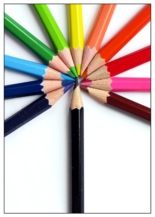
One of my photography projectA composition of color pencil
 (Smile)")
Related content


Comments: 146

Pretty cool, although curious as to why that marble is there?
👍: 0 ⏩: 0

While using coloured pencils has been done before, your image is a lovely one. It's nice that you've got the wavy line and the little marble balancing on some of the penciles, it just adds a nice little touch.
You should be very proud of this

👍: 0 ⏩: 0


geez mate, you have a good hand. this one is impressive. simple but impressive and indeed attractive picture to look at
👍: 0 ⏩: 0

haha I love this!
Beautiful colors
great composition!
👍: 0 ⏩: 0

sungguh konsep menampilkan pattern kayak gini keren banget
👍: 0 ⏩: 0

EEEEEEEEEEEEE colourful-ness!!!!!!!!! 

👍: 0 ⏩: 0


Very original idea o.o It came out beautifuly. Congrats!
Great pic.
👍: 0 ⏩: 0

Oh man.
This is so neat.
I love how bright it can still look with all of the neutral colors included.
Wonderful.
👍: 0 ⏩: 1


Dude I like this photo! It's so simple yet the colors is what attracted me! Awesome!
👍: 0 ⏩: 1


I like ithe motion; the center really attracts the eye and moves it along the wave. The yin aspect of it is pretty cool as well, but I think it takes a little more time to notice because the harmony side, and the wave attract so much attention.
👍: 0 ⏩: 1

That's good if the motion attracts more attention
👍: 0 ⏩: 0

yaa.. iseng2 berhadiah aja cing!
👍: 0 ⏩: 0

i really like the curve and the colours here... but i m not so sure about the marble(?) in the upper right corner... i don t see a connection to colour harmony ... and if it is the ying-yang thing then i miss a second marble
👍: 0 ⏩: 1
")
The marble works as an accent, to make the photo less boring, i only use one marble, because using two would make the photo too balanced, and have no accent (point of interest)
👍: 0 ⏩: 1
yep it is definitely a matter of taste... but i think would not be boring at all
👍: 0 ⏩: 0

wah bagus...hehehe...itu yg di atas gundu ya?
👍: 0 ⏩: 1
Iyah Gundu
keren dikit donk, marble donk ah
")
👍: 0 ⏩: 1
hahahaha...pake bahasa indonesia yg baik dan benar donk...gundu!!! (hehehe...keras kepala)
👍: 0 ⏩: 0


keren, cm frame nya agak kbesaran mnurut gw.
👍: 0 ⏩: 1
Iyah, color harmony.
Frame sih masalah selera doank
👍: 0 ⏩: 1
 (Wink)")


a very used kind of setting,
but you still photographed it wonderfully
i must go check out your gallery, cause i see a few things that i already like
but may i ask whats that pearl like thing on the top right corner?
👍: 0 ⏩: 2
Thank you
It's a marble
Mrs Morzarella's quite right, you see the left part is a color harmony gradient, while the right part is messy
it took a bit of yin yang's principle.
Thank you for checking my stuff
👍: 0 ⏩: 1

Whoa, I didn't realise that at first. Great concept, well executed.
👍: 0 ⏩: 0

I think it may represent the "dot" in ying and yang - to which he seems to refer by using the "wave-form" in the middle...
👍: 0 ⏩: 1
")
wow
")
👍: 0 ⏩: 1
<= Prev |