HOME | DD
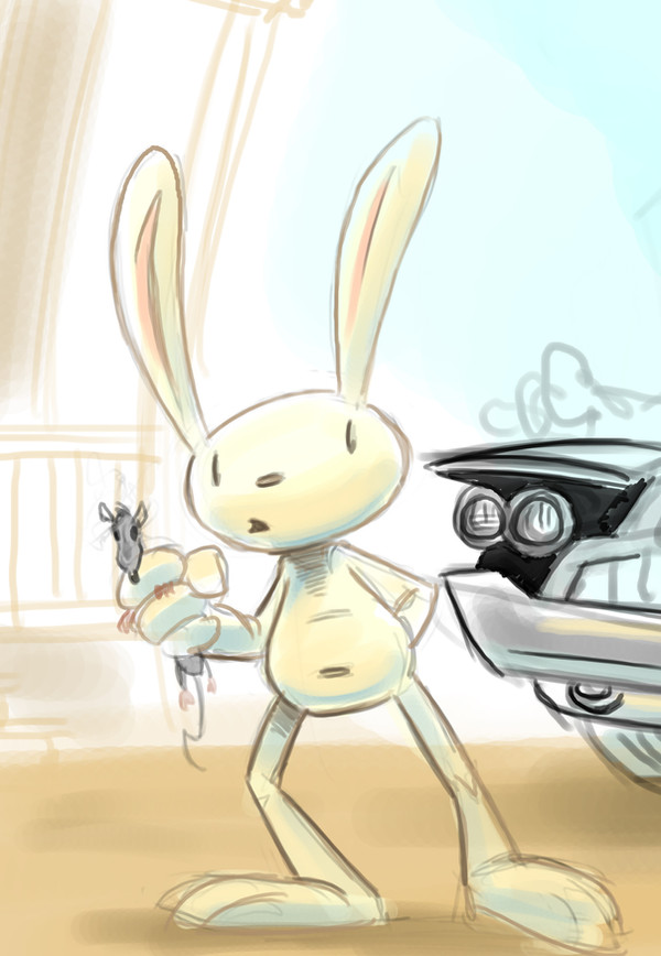
 Hesstoons — Sam and Max old and new.

Published: 2011-07-11 03:56:44 +0000 UTC; Views: 5178; Favourites: 95; Downloads: 43
Redirect to original
Description
Throughout the years of developing as an artist, you look back on your older work and it seems terrible. But you can't be so critical of yourself. You need to learn from how you used to work, and how you work today. I never create anything the same way twice, whether it be a meal or a piece of art. SO I have been seeing people going back and either redoing some older piece or touching up one of those terrible pieces that you can't stand to look at anymore.This is one of those pieces that I cannot stand to look at anymore, and I know my improvement on the piece isn't that great either. But it shows you some growth. I spent hours drawing and coloring the first one. Now the original drawing was copied(not traced) off of an image that I found online. Took me forever to draw it, and even longer to color. I was learning how to use Photoshop as a tool, and now when I use it I don't think twice. When I went to re color the image i wanted to redraw it, but I realized that would take away from the image not enhance it. I have always been comfortable with my drawing ability, but not with my coloring, not to say that I haven't grown in that area as well. But here it is a new version and the old one Enjoy!
Related content


Comments: 12

The first one makes me think of the comics and the newer coloring kinda makes me think of the games in a way. I kinda like both.
 (Smile)")
👍: 0 ⏩: 0

I'm sorry to burst your bubbles but 2004's version is so much better.
👍: 0 ⏩: 0


To be honest I prefer the old version. I like the grunge-y colors better than the brighter, happier look.
👍: 0 ⏩: 0

i love this piece, bc i enjoy going bak to some of my decent pieces and re-doing them- its really fun to do
👍: 0 ⏩: 0


Well, as I recall the original is how it was colored on the poster, so you can't really be critical of yourself in this instance since it was how the original was done.
👍: 0 ⏩: 0

as cool as the new update is. The older version suites the Sam and Max 'feel' better. What with that cliche comic book look of the early 90's.
Still awesome though, good stuff.
👍: 0 ⏩: 0

Yes indeedy the top one looks more comic-booky. ")
👍: 0 ⏩: 0

I agree with the poster below. However, you have improved indeed
👍: 0 ⏩: 0

I actually like your older drawing more than the newer. It gives it more of a comic panel feel with the hard lines. I do agree that your colouring has improved. Great work.
👍: 0 ⏩: 0
