HOME | DD
 Hillnerd — THE 13- issue 1- cover

Published: 2008-03-07 09:41:36 +0000 UTC; Views: 2312; Favourites: 23; Downloads: 86
Redirect to original
Description
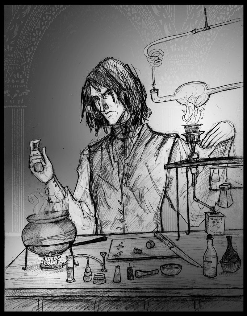
link --> next page(c) hillary weeks
Here it is! My very first cover!
My very first logo!
My very first!
This is the begining of my baby- my comic I've been plotting, planning etc. for over 6 years!
")
This was done with copic markers, excepting a few details that were done digitally, like the logo.
I'll probably be posting the pages a few at a time.
 (Smile)")
REVIEW THIS PLEASE!
click download to see it in monstrous proportions.
And yes, his hand is supposed to be deranged, with different lengths of knuckles etc.
Special thanks to:
Morgan Baumbach- my sounding board, best friend. and my push to finally DO IT!
Matt Frank- Who is great for advice and enthusiasm
Annabelle Bay- Who, years ago, helped me very much with this little nugget of an idea! XD
Related content


Comments: 10

I love 'The 13' logo. Very creative. This cover kinda gives an essance of what this comic is about. The essance says 'Creepy, Unfortunate and Scary as Hell'
I'm excited!
👍: 0 ⏩: 0

I'm looking forward to that!
Woah, total 'CRAZY GARY OLDMAN!!!' moment right there. Third movie all over again...Now if we could only stick a blue-eyed emo kid in there, it'd be a complete remake.
I love the light source in this picture. Plus, his eyes haaaaauuuuunt you. o.o
👍: 0 ⏩: 0

Dude,that is some scary shi-te--I LOVE IT. Can't wait to read it, and congrats!!
👍: 0 ⏩: 0
fearblank [2008-03-07 23:50:49 +0000 UTC]
I love the logo... ^^... great work on it... I can't wait to actually see the comic... ^^
👍: 0 ⏩: 0

oh wow. simply splendid! I love your attention to detail. & the logo.
yay! you finished it!
👍: 0 ⏩: 0

Whoooa! ")


👍: 0 ⏩: 0

Creepy! I love the logo, tis very good, although the E of the THE gets a bit lost in blackness.
👍: 0 ⏩: 0

oooh! I like it!
it's really scary! in a good way tho!
I love logo.. very cool...
 (Wink)")
👍: 0 ⏩: 0

This is really quite frightening, and I mean that in the nicest possible way, because I'm sure that's the feeling you were going for right?
The logo's lovely and the whole thing is intriguing, really. From the darkened face to the triangle thing....
Can't wait for it to begin!
👍: 0 ⏩: 0

Congrads on bringing your idea to life! The lighting is great and I love how you drew the eyes. I'm looking forward to it!

👍: 0 ⏩: 0