HOME | DD
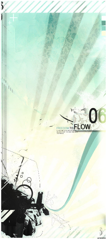
 Hoaders — Flow.
Published: 2006-05-13 16:57:05 +0000 UTC; Views: 7779; Favourites: 100; Downloads: 372
Redirect to original
Description
//Flow.Wanted to try something new and different for me. A bit trendwhoreish, but that was the plan. I'm really pleased with how it turned out =]
All my work accept for the floral pattern and the white flower around the soldier.
C&C appreciated.
Enjoy.
Related content


Comments: 66

")


hey man, thats really impressive... i like it alot. What proggie you do it in?
👍: 0 ⏩: 1
")

Cheers.
Made during my time spent 'revising'
Oh and I saw loadsa people from St clements on Sat. All at their confirmation which i went to watch...
")
👍: 0 ⏩: 1

confirmation?! lololol oh dear.
who u see?
👍: 0 ⏩: 1
-joe
-luke
-liam
-clare
-holly
-sarah
-laura
-mellisa
-michael
and i might of missed some people.
👍: 0 ⏩: 1
lolol that woild be jokes to go back and see everyone again
👍: 0 ⏩: 0

Excellent work my friend. I like how you melded those custom shapes and made a nice faded pattern for the background, although I wonder what the pattern would look like if it were coloured with a gradient to blend more into it, just throwing in an idea : /. Also, I think the spot you placed the text was good and the format you set it up in was well planned, too bad the 6 cuts off on the side 
")
Well, I hope this was advanced enough for you. Although I find it sad I have all this advice and can't carry it out myself, at least I can pass it to you and you'll be able to use it. A fine job and I hope maybe another one like this but with new colours and a bit more hoaders, if that makes any sense.
I tip my hat, I may even try to do something like this... but probably not so catch ya on the flip Hoads.
/zzz
👍: 0 ⏩: 2
Thanks alot for the time taken to write that. Every point you made is true, and tommorow i will rectif the errors. I think i got quite lazy near the end, mainly because i just wanted to finish it. And i only just realised the texture over the bottom left shape. It was meant to be flat black, I think it was to do with the displacement filter. I like to keep the hoaders name quite inconspicuace, so that you can only see it if you look hard enough.
I really didn't think this was going to turn out well, and it just started off as a random experiment and decided to carry it out, and i really didnt' think it was going to turn out to be a finished peice. And i'm defintely thinking of doing another one like this.
Oh and you should just dive right in there and have ago, i'd love to see it
talk soon bretherin. xxx
 (Smile)")
👍: 0 ⏩: 0

<= Prev |