HOME | DD
 HOON — XII

Published: 2003-12-11 14:15:32 +0000 UTC; Views: 62414; Favourites: 853; Downloads: 12094
Redirect to original
Description
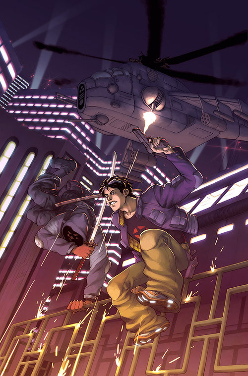
12.This is one of the very first concept work/cover art done for TIMESCAPE MANIFESTO. 1999-2000 about one month of technical labor, from the blank paper, to full rendering. using optic mouse and photoshop 6.
question authorities!
Related content


Comments: 153


is that what your mom taught you to be like during the sun-baking trip, son?
👍: 0 ⏩: 1

YEAH!@
;p glad i am remembered hahaha
👍: 0 ⏩: 0


Awesome work . looks like a fram from a video or something ")
👍: 0 ⏩: 0


really nice, well done
but i see a little mistake ;D
on the left side the reflection shows an image of a creature which is in the front
that cannot work
👍: 0 ⏩: 0


this must have taken a lot of work.
i like it very much.
👍: 0 ⏩: 0

The detail is amazing, really like the guy up close who is materialising! Amazing
👍: 0 ⏩: 0


Mental, especially love the bloke's fingers and gun/grappel/high-tech-gizmo-thingy he's got in his hand.
I'd be interested in what the original sketch looked like...
👍: 0 ⏩: 0

")


Nice, Almost confusing. The robots kinda ressemble the phantoms from FF: The Spirits Within.
Did you use a 'brick' texture on the pic?
👍: 0 ⏩: 0

This is intense.. Great art, no wonder it took you a whole month to do it! I love the details tho you can't really see them lol
👍: 0 ⏩: 0

wow *.* great colors here and the perspective is amazing ;_;
👍: 0 ⏩: 0

Holy crap...this is...the buildings...the coloring....the beauty...ohmygod ^^

👍: 0 ⏩: 0

awesome
👍: 0 ⏩: 0


interesting concept! very cool line work and great colors!!
👍: 0 ⏩: 0


The perspective on this is incredible... very well done.
👍: 0 ⏩: 0


*attempts to belittle it by compairing it to the work of established artists and Hollywood movies*
..
(I'm trying to be funny.)
Lovely mech design!
👍: 0 ⏩: 0

you are so awesomeness. with optical mouse? jeeze ;_;
👍: 0 ⏩: 0

Thats some crazy stuff you got there... nice work
👍: 0 ⏩: 0
Thats some crazy stuiff you got there... nice work
👍: 0 ⏩: 0


HAHAHAHA
get on the line, join the club
👍: 0 ⏩: 1

hell are you forgetting that I MADE the club?
👍: 0 ⏩: 0


if chillroom had a fav button, i'd have done this already

👍: 0 ⏩: 1
Thanks martin. appreciate it very much.
well, the room needs so much maintainance but i do not have time for that right now. now, chillroom is sort of like haunted house of art. but thats okay. as soon as i finish my project, i will revitalize the room, and serve tequila!
👍: 0 ⏩: 1
mmm tequila, and get some dancing girls
👍: 0 ⏩: 0

It looks like a scene from a movie. A little Matrix-y and Neon Genesis Evangelion-ish too.
Good job, oppa

👍: 0 ⏩: 0

Hoon you legend...one of your most cool works..
no choice but to fav
👍: 0 ⏩: 0


Im not sure that i like the blurry, almost surveillance camera look to it. But it does still rock muchly. I love the sky scrapers best
 (Wink)")
👍: 0 ⏩: 1
original version of this is very sharp and crispy- 400DPI 11 inch by 17 inch.
infact too sharp on some area like where atmosphere should be. so when i uploaded to GFX, i tweaked out to have more atmoshere and soften the lines. but when i posted it here, instead of going back to original file, i just made 640 width jpg bigger and added afew textures to bring out the second-hand-store-a-bit-thrashed-though- it-looks-intentional.
👍: 0 ⏩: 0
<= Prev | | Next =>