HOME | DD
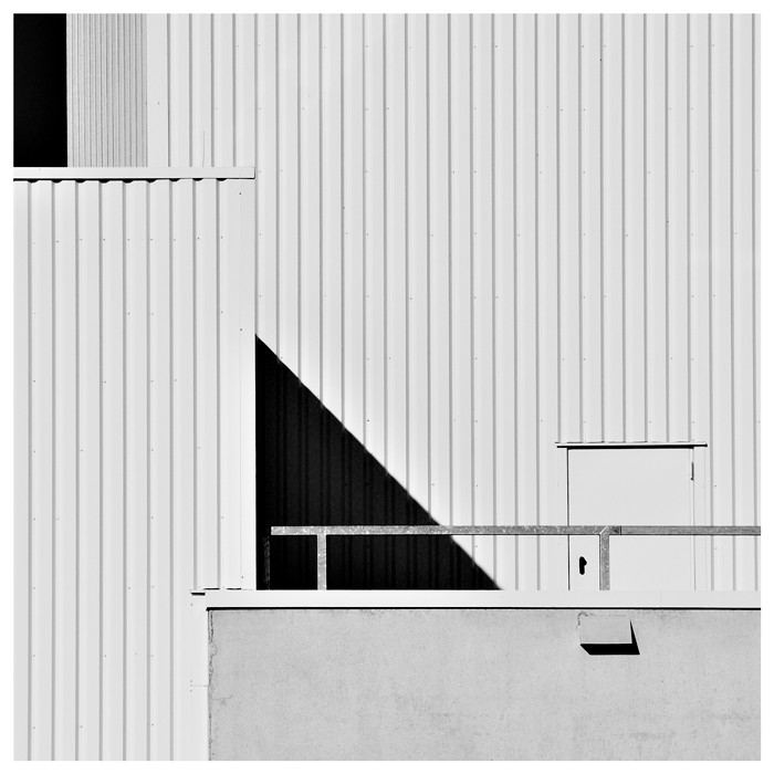
 HorstSchmier — Square 01 color

Published: 2007-12-08 22:17:51 +0000 UTC; Views: 1821; Favourites: 132; Downloads: 0
Redirect to original
Description
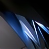
Following the suggestion of which is always wise to do (he he), this is the colored version. Beside that I chose a slightly different crop which might look a little bit more pleasant, at least to me.Related content


Comments: 75

really must think about Mondrian when you see this....like it
👍: 0 ⏩: 1

Yes, also Mondrian painted in colors  (Smile)")
Thanks for your comment, Karmen, much apreciated.
👍: 0 ⏩: 0

gefällt mir so auch besser
nice
apropos mondrian , ausstellung startet hier in köln
.... achja , heute
[link]

")
👍: 0 ⏩: 1
Danke! Ja, sieht besser aus in Farbe. Und nach Köln sollte man ja vielleicht mal fahren ...
👍: 0 ⏩: 1
war mittlerweile in der mondrian-ausstellung
nett , schick, gut ...
ausserdem kann man parallel in die chargesheimer-ausstellung
👍: 0 ⏩: 1
Jaa, ein grund mehr nach Köln zu fahren
👍: 0 ⏩: 0

jaaa. looks great. think I like this much better
as mentioned above: almost a mondrian...
👍: 0 ⏩: 1
Thank you so much, michael. It has been you, who has driven me to this color version. This picture has been from first sight a b+w version for me. And I have been rather surprised by the suggestion to make this a color one. But you are comletely right. A good example for "Tunnelblick" *LOL
Thanks again, best wishes ...
👍: 0 ⏩: 0

Oh, thank you so much, denis. A great honor to read this
👍: 0 ⏩: 0

Thank you so much, Jessica

👍: 0 ⏩: 1

I like it very much! the blue square reprisents for me the little hope, hanging up there, as a kind of promiss for a better.... whatever - something!
great idea and perfectly done!

👍: 0 ⏩: 1
A very interesting description of this picture, Ilil, like it very much. Gives me some hope too ...
👍: 0 ⏩: 1

Not much time for photography cos of work. Just popping in. Really like this one. Got my E3 and hope to get out and about with it soon. Love the camera so far!
👍: 0 ⏩: 1
Thanks for your "stip visite" Eugene. Glad you like this. Nice to hear about your E-3, hope you´ll get soon some time to work with.
👍: 0 ⏩: 0

Can only echo the above - even better than the b&w. A really striking image - great shot!
👍: 0 ⏩: 1
Thanks Nigel for your comment. Yes, thanks to michael, an enhancement is visible I think.
👍: 0 ⏩: 0
This is much better than than the B&W version; in a number of ways.
The blue 'square' gives the image a very Mondrianic feel.
The new crop helps to emphasize this. It takes the attention away from the door on the right... from which I think the image profits a bit
I like the higher contrast of the pict, the bright white facade is much better than the mid-grey one in the B&W shot.
Nice one!
👍: 0 ⏩: 1
Thank you so much, Szabolcs, for your nice comment. Glad you like this and also the slightly different crop. Looks better to me too.
👍: 0 ⏩: 0

I like this a whole lot more in colour, good choice. Almost Mondrian in a way...
👍: 0 ⏩: 1
Thank you so much, Zach, for your thoughtful comment. Yes, the color version looks not bad ...
👍: 0 ⏩: 0