HOME | DD
 iadinaplus — Portfolio CD Interface
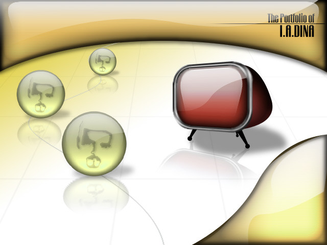
Published: 2002-08-27 05:34:31 +0000 UTC; Views: 1425; Favourites: 0; Downloads: 124
Redirect to original
Description
I am about to make my portfolio CD and here's the interface for that plz comment is it good or bad??? or anything more required????Related content


Comments: 14

I'm an emotional nut....to be really honest with you. It's a really really cool portfolio cover, even poster.....but doesn't say anything about the type of music. All I think of is zombies watching the television set, or that weird move "1982"......
I like it, but I don't think it should be used to introduce a compilation of music....something with emotion, or theme. Like, what do you see when you sing or hear one of your songs, your favorite song, you yourself wouldn't mind hearing over and over and over. Or better yet, if you were going to take one song, and use it to represent yourself, what would it be, and what images would you get by hearing it.
When I see this, I think of mass production, the economy of music. Looks awesome....(future poster) but you need something with emotion to introduce yourself....
That's just my honest opinion....
👍: 0 ⏩: 0


how do you do that glassey look? I wish I knew how to do that.. hella nice work
👍: 0 ⏩: 0

cool..hey how do u guys make the glassy look like that i cant find any tuts (
👍: 0 ⏩: 0

this is really awesome. great idea. heh...it reminded me of [link] this is good tho
👍: 0 ⏩: 0


I think its a great start - the shiny effect is really eyecatching. Is each sphere gonna contain a different image? Still, its a funky yet instantly usable interface...
👍: 0 ⏩: 0

Looks pretty sweet. The first and second balls are a little jagged and the black border could be just slightly less (about 2 or 3 px). Love the reflections and the grid to add depth. I really like the font you choose for the text but personally I think a medium shade of blue would be a nice contrast with the other colors. If this was done in flash you could have the balls roll in on the line using paths.
You left plenty of room for content and I’m looking forward to seeing the finished site
👍: 0 ⏩: 0

Oh looks very cool. One point:
The upper frame of the TV is kinda blury.
Anyway that would become a nice portofilio CD-Design.
Will you integrate this in Flash?
👍: 0 ⏩: 0


i think its kewl...i bet u were gonna prob do this...but u should have when they put there mouse over the tvs/heads the selection name comes up in the red tv
👍: 0 ⏩: 0

That's really cool, are the heads/tv going to be different areas of your portfolio?
👍: 0 ⏩: 0