HOME | DD
 iamrobot — My ecstacy is ecstatic

Published: 2003-01-05 23:57:41 +0000 UTC; Views: 200; Favourites: 0; Downloads: 9
Redirect to original
Description
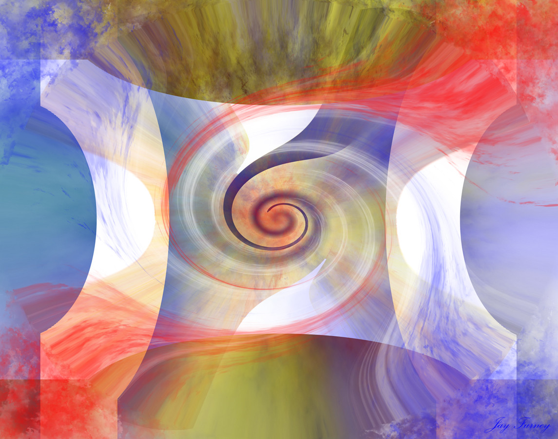
Trying for simplerdesigns, as well as working with colors I normally wouldn't useIllustrator, PS
Related content


Comments: 9

wow i like this man, id personally remove the design behind the shirts, but awesome stuff
👍: 0 ⏩: 0

(runnin outa "kool" like words)
lov the hair.
good stuph
👍: 0 ⏩: 0

ha! Blue is my prefered color, but thanks for playing!
👍: 0 ⏩: 0


I agree with previous posts. this was my favorite of your works made recently. I think instead of circles you could use some shapes you used in the hair to make the line on the right. but I dont know, I never know how things will look till I try and Im usually wrong on my first shot. was this created in illustrator? its very cool. I enjoy the twins
👍: 0 ⏩: 0

i like the fact that they appear cut 'n pasted, but they're not. the subtlety...
one is male, and the other female, correct? i could make all sorts of radical inferences, but i'm not sure my unsubstantiated interpretations would be as entertaining for this piece.
i think bumbaryca may have a point about the circles; however, depending on what you think the piece "means", they fit in a rational manner.
i really shouldn't comment so late at night/early in the morning. all i really wanted to say is i like the piece and all that jazz. but you probably already knew that.
👍: 0 ⏩: 0

and i addore your pick of border color, and the tiny amout of it !! perfectly chosen!
👍: 0 ⏩: 0
from three new submittions you've done, this one i like most! like the difference between big amount of coloured surface (and pink!) and than those uncolored elements, again very simple in them's surface.
my opinion is, that there is not such a need for bubbles on the right part , somehow, their nature is to different from the k+line characterisstic u used on the rest of the pic.
but i like the piece, be sure. that's why i am analyzing it
keep up strange coloring and keep up mixing the plain surfaces with the rich one... you can get crazy things doing that
👍: 0 ⏩: 0

you're weird dude
I especially like the pinched mosaic in the forefront form's chest, fits right in
👍: 0 ⏩: 0