HOME | DD
 ice-hf — Space Pirates
Published: 2002-05-03 19:09:43 +0000 UTC; Views: 2621; Favourites: 13; Downloads: 1156
Redirect to original
Description
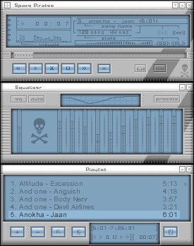
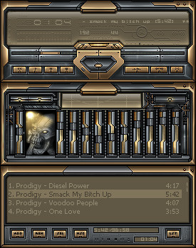
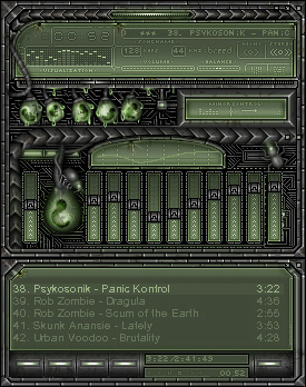
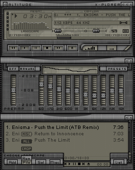
Classic design.Please comment.
Reuploaded
Related content


Comments: 33


looking back, this is probably one of the most underrated skins on devart. i find it in often rotation (when i'm not being a egomaniac and using one of my own skins, heh).
👍: 0 ⏩: 0


Great work, I have got some inspiration now, Thanks
👍: 0 ⏩: 0


This is so perfect. I love the design I love the color. i love everything.
👍: 0 ⏩: 0

very sleek
cheers dude
insta fav
-----
one superlative song
existance its price..
👍: 0 ⏩: 0

current skin
-----
....and nothing else matters.
[link]
👍: 0 ⏩: 0


Sssssssssssleeeeeeeeeek!
-----
-thk
[: Difference is Excellence :]
© 2002 Madava Dilshan Vithanage
👍: 0 ⏩: 0

Wow! Very solid design. Everything seems to fit to me. The song title text is a little small, but that's a minor complaint. All the details are very subtile, and not too obvious, and they leave a clean look easy to use, but appealing nonetheless.
Two thumbs up
-----
...
Bite the hand that feeds you
👍: 0 ⏩: 0
arrr....
text might be a few pixels too bright, but it still works anyway. great design.
👍: 0 ⏩: 0

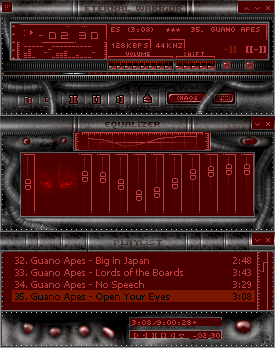
Kick arse. Looks like a space ship with the darker stripes. Great work, a very smooth skin.
Gets my vote for DD.
-----
»sekt
Cyberpunk MMOG? Citizen: Zero
- www.citizen-zero.com -
👍: 0 ⏩: 0

nice!
but the blue is a bit too dark, or the metal is too bright
great work
👍: 0 ⏩: 0


very nice indeed!
-----
My site: [link]
Breed: [link]
👍: 0 ⏩: 0

like i said @ VA g00d job here! clean and smooth skin!
-----
you can not escape us!!!
👍: 0 ⏩: 0

feckin wonderful! though i love everything with pirates
👍: 0 ⏩: 0

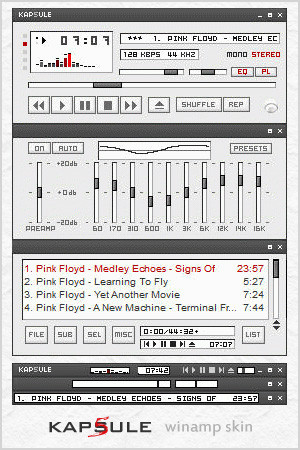
This is a very neat skin. The overall design, colour scheme and the buttons specifically are done very well. Not to mention the groovy equalizer sliders.
A few points seem to throw me off a bit though. The bevelling right at the edges seems a bit over done, just by a couple of pixels. The other little point is that the position slider on the main window could be more defined with some extra shading.
Other than those couple nitpicky points this is some choice work. Keep it up!
👍: 0 ⏩: 0


beautiful skin! nice, smooth, and has a great color scheme!
-----
Proffasee :: Seeing The Future
__________________________
[link]
👍: 0 ⏩: 0


outstanding! my new skin, probably for a long while.
👍: 0 ⏩: 0

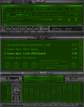
Looks nice - I really like the darker diagonal grey accents.
👍: 0 ⏩: 0

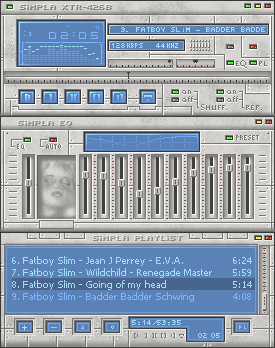
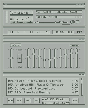
yo that's pretty fat. i like it all but the viz, and the blue window in the eq could use some extra detail.
👍: 0 ⏩: 0


smooth and minimalistic, excellent skinning job
-----
[ ] is defined from within
👍: 0 ⏩: 0

i love this, but i dun like the cbuttons too much, maybe something metalic would look better, but overall its great! nice job.
-----
fading from one day to another, fading till i fade away...
👍: 0 ⏩: 0

that is so clean! i love it. the bevel looks great, as well as those gelly cbuttons. great skin man!
-----
+_____////angelsfaith
+_____////[link]
👍: 0 ⏩: 0

look clean and smooooth, i like it!
The skeleton looks a bit weird in the overal tough..
-----
Daniel
Blend-Design
[link]
👍: 0 ⏩: 0

clean, but i like it. i love those sell-like buttons. very nice
👍: 0 ⏩: 0
