HOME | DD
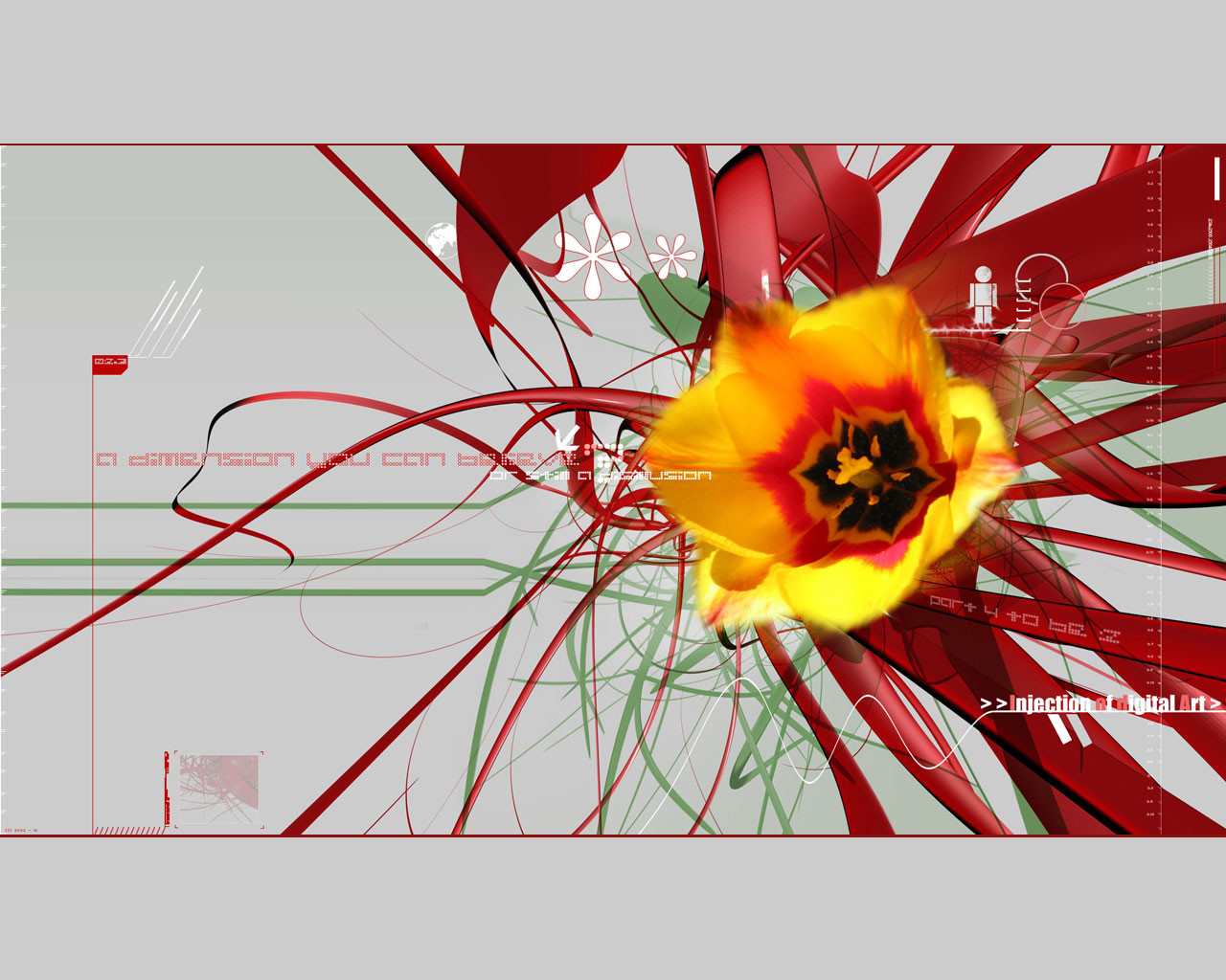
 ik1 — Part 4 to be 2
Published: 2002-04-25 15:34:44 +0000 UTC; Views: 2733; Favourites: 15; Downloads: 632
Redirect to original
Description
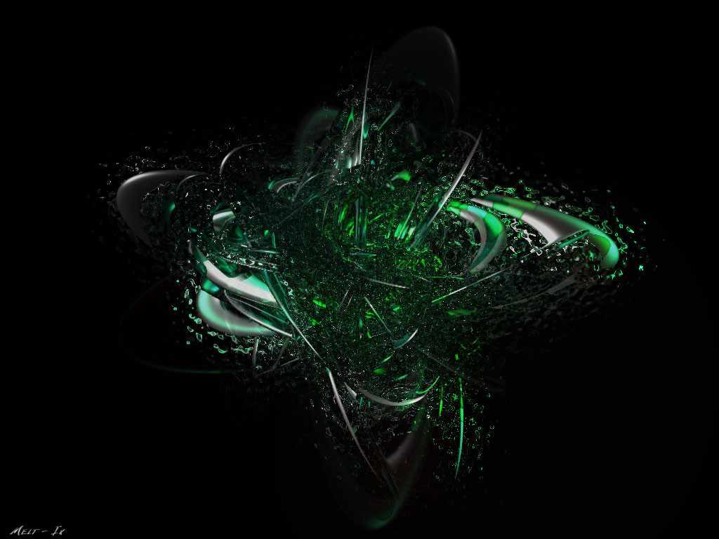
Ok this is beter then the last one ..[Big size] [link] [2000x1125]
Please do enjoy this ..
Ik.
Related content


Comments: 18

this is a super cool dev, all techy, but the flower rocks it all the way.....
These techno flowers are super cool
keep rocking
👍: 0 ⏩: 0


wow great work.. I love the viney things behind the flower.. +favs
-----
BIN LADEN SUCKS [link]
👍: 0 ⏩: 0

This look like a fire flower to me
you should have put your bg black, it would be more contrasting
nway, this is some awesome progress!
May god bless your cinema 4d ahah!
-----
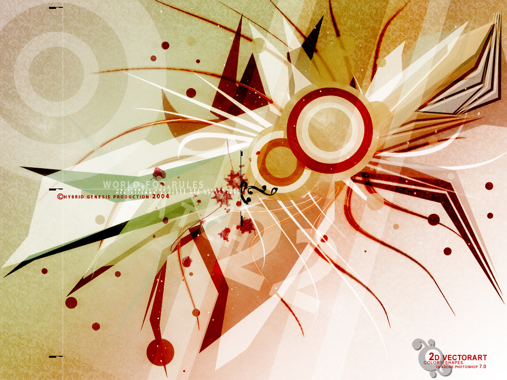
[.teknoledge.][.abstract.designer.].
[. [link] .]
👍: 0 ⏩: 0

I don't really like the flower because its edges are blurry...others are great~
-----
Angel of the Night
Visit Angelworld now
[link]
Version 7 - State of Iridescence
👍: 0 ⏩: 0

very unique indeed, i like it! nice colors, good concept, well done!
👍: 0 ⏩: 0

Que lindo ..very nicely done this is great
-----
Design Is Something But Typography Is Everything.
👍: 0 ⏩: 0

this is good..but i have to say i like the original better...i like the red forms still
-----
::the new state of design::
are you ready? [link]
+
=
👍: 0 ⏩: 0


beautiful and crisp and bold nice work. i do agree the blurring the edges of the flower was a bad idead, but othe than that it's excellent.
font treatments are really good, and the simple shapes are awesome.
👍: 0 ⏩: 0

I love to see things that are really different, and this is just that The colours and everything. What really makes this is the flower
-----
Hyper Kitty
A Comment Given, A Comment Received
👍: 0 ⏩: 0

liked the otherone better , but nervertheless - great !
👍: 0 ⏩: 0

I agree about the blurriness... in fact I might even go a step futher and wish for those fine black lines to creep their way in onto the petals to add sharpness to the flower, make it seem a closer part of the composition.
But I also agree with the awesome natural explosion of color from the pit of the flower!
cool shiz.
PL
👍: 0 ⏩: 0

gorgeous-tastic! I like the mix of photo, 3d, and 2d, especially the asterisks. it all comes together fantastically.
keep it up!
👍: 0 ⏩: 0

Very nice...going in my fav folder...i agree with poluter though, your background is very crisp, but the edges of your flower rn't...but it still looks great.
👍: 0 ⏩: 0

cool! the red stuff in the background is awesome... the flower would, in my opinion, look cooler if it wasn't that blurry in the edges. Very nice overall!
-----
[link] | abnorm thinking
[link] | me
[link] | my comics dev. pack
👍: 0 ⏩: 0

ohhh wow, ultra funkaaay! absolutly luv the flower, sorta like an explosion of color
👍: 0 ⏩: 0

Amazing, unique, and beautiful choice of colours! +fave!
-----
👍: 0 ⏩: 0