HOME | DD
 ioco — Staring Into The Dead

Published: 2001-03-07 12:02:17 +0000 UTC; Views: 693; Favourites: 0; Downloads: 128
Redirect to original
Description
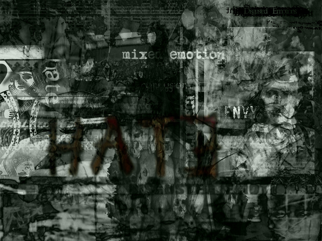
Call it a rotted world , change comes with the flood , distinguishing the soul..-loco
[edit] - added more sizes , since it was one of my older submissions , i didnt do random sizes , now includes 1152x865 and all below it , enjoy.
Related content


Comments: 12

In ways it posseses attitude. I like. Im impressed, keep up the good work and keep increasing them skillz.
👍: 0 ⏩: 0

word!
"get the fuck down off of the cross we need space for the next one".
Flesh
http://obliviousflesh.virtualeweb.com
👍: 0 ⏩: 0

...hmm very deep? i dont really like it but u got some nice image wraping...
👍: 0 ⏩: 0

i'm tellin you...first time i saw that, i thought he had no head ;x but anyways, the lack of colours (more so black and white) makes this great. a lot of times more colours in a piece like this would lessen the interest. great work.
-lori-
👍: 0 ⏩: 0

All I've time at the moment to note is: the depth presented behind and around the crucified Christ is awesome.
[-diGiTaLdecay-]
what.a.pixelated.web.we.weav e
👍: 0 ⏩: 0

i'm scred j/k
thats like a horror movie into one pic a old time horror
-LeDSiuS- ~RaL Crew~
👍: 0 ⏩: 0


The blood in the top right corner, though done well, stands out a little much. You use a monotone color scheme, and then hit up a blaring red there and you can't stop looking at it because it's so red. Heh heh... though it is an interesting compilation of images of Christ's crucifixion. However the images used don't mesh as well as I think they could. Some are too blurry, where as others are too sharp, and the placing of some of these next to one another creates a bit of visual stress, like the image doesn't flow well together. Then you have the image of the hand holding a crucifix, but you can't really see that, as I think you should. Being that the title is "Staring into the dead", this particular image seems a first person perspective, as though you are allowing the viewer of the image to become one with the piece... or something. Anyway, just my opinion here.
👍: 0 ⏩: 0

wouldn't "eclipze" then be a typo as well? that is, if we are being technical.
nice work.
👍: 0 ⏩: 0

First thing I thought when I saw the title: Is that a typo? I guess you would normally say looking at the dead. But I might be wrong. Not bad wallpaper anyways.
-[EclipzE]- / .:Ecliptic Illusionz:. / .:Vortex Designs:.
http://www.vortex-designs.subnet.dk
👍: 0 ⏩: 0


Creeping along my skin, I feel no life.
This is freaky, very dark and full of expression. I like it a lot, it would be nice to see more layers and transparent blending.
Good work!
isonica.com
👍: 0 ⏩: 0