HOME | DD
 ip — Bosch Space
Published: 2003-11-05 03:19:31 +0000 UTC; Views: 731; Favourites: 2; Downloads: 362
Redirect to original
Description
Just a quick design for the new website. It's not completely functional, nor is obviously all the content loaded and the copy will be changed, but wanted to get some response on the design, navigation and overall feel of the site.Needs to be viewed in 'full' to see the site. Remember, the background will be white as well - if you click the 'download' button under the image it should give you that. Comments and criticisms are greatly appreciated.
Related content


Comments: 8


Well sir, I enjoy the work that you've done here. Never mind all of the comments that say the text is too small: I assume that the actual site wouldn't be this small, right? So obviously the text in the final product will be larger! I like the idea of that black bar coming down when you click on a link and text/images appearing after it comes down; what I would suggest is, if at all possible, to make the bar come back up when you click on another link, and then come back down to display the new link.
I'm also curious as to how you'd handle a situation where there would be a considerable amount of text such that it would require a scroll button. As your layout is currently three columns of text, I think it would be hard to translate that into something that was scrollable. Do you know what I mean?
Okay, enough out of me.
Cheers,
JTroll
👍: 0 ⏩: 0

Ok, just a few things. Good solid design. I like that. Navigation is simple and well layed out.
This is what I would change. Make it bigger - the text that is. After all, the text part of the site is pretty important, and if it is as small as that people will have trouble reading it. Last thing, i don't like mailto: links inside flash. You never know if it is or not. Make it NOT. Have it pull down a section that says "You can contact us by mail, blah blah blha, or by email: joe@bas.com" and have the email address be the mail to.
okbyenow!
👍: 0 ⏩: 0

my opinion?
ok, how bout this...
my first impression of the site was great! the picture caught my eye first, and reading the words "are you interested" got me interested; i wanted to see more. then, naturally reading from left to right, my eye went to the right where i saw the logo and the empty blue space - nice!. then, that logo/space led my eye down to the justified type, and then my eye continued it's path down to the navigation. then when i clicked a category it revealed more and i said to myself, "wow! there's more than meets the eye!"
up until that point i was liking everything! the presentation of the site was working it's magic!
anyway, moving along...
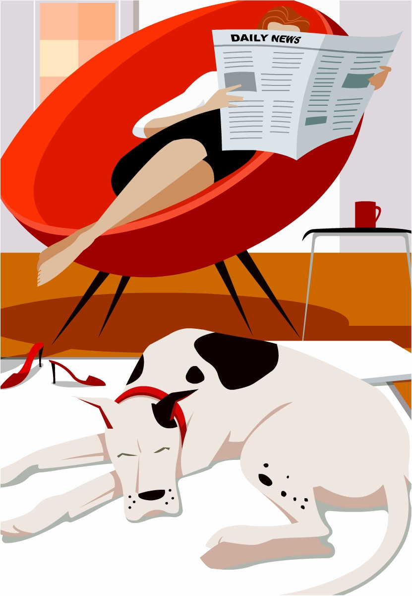
the first place i hit up was the 'about' category. sorry, im afraid that i have to 'Boooo' you on this one. why? because of the layout. the text columns are spaced too far apart, causing the flow to not flow as well as it could/should. then there's the picture that is used there... Yes, it does say that they're hard working, proffessional, and enthuastic team workers, but i think that a message like that could be accomplished better.
how?
well, i don't know what picture resources and quality you have to play with, but i think that these "virtues" can be accomplished more effectively by using two pictures instead of the one. by doing this you can divide the " workload" of the picture in two, thus allowing each picture to convey it's message more prominently and have the pictures work as a team to convey the virtues of this organization even more effectively.
what about space?
is there enough space to drop in the second pic and fit all the text?
i would say that there is, because the next thing that bothers me is the empty space found between the navigation bar and the content of each category. i think that there's a little too much space happening. plus you've got every picture touching the bottom black line. did you try dropping in the content 'vertically centered' with an even amount of space between the top and bottom? i think that it would be more pleasing to the eye that way, plus you would have little more room to play with a second pic!
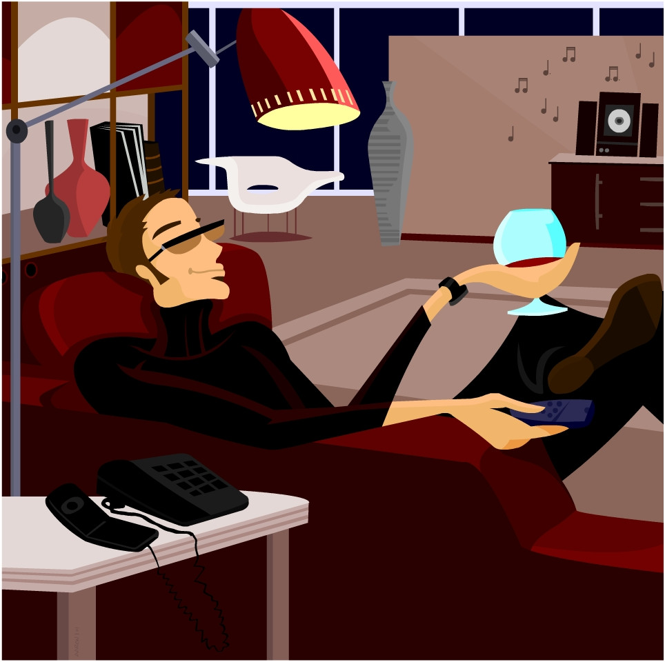
oh, and i love the "shop" picture you got going on. it says smart smart shopping. i would be tempted to replace that with a vector drawing, but it would be risky because you could throw off the balance of the site.
the last bone i have to pick has to do with the navigation. yes, it is laid out very nicely; simple text is the way to go. the only thing that annoys me is how everytime you hit a new category that black line does it's refresh thing. i liked it the first time, i thought it was acutally pretty cool! so, my recomendation is to set the site up so that it only does it the first time, then every other time you hit a new category it just quickly fades to the next.
yes yes... that's my two cents worth.
just delivering what you asked for... opinion!
cheers hoser!
👍: 0 ⏩: 0


Nice work, my only complaint is that it's too small >.< The text at the bottom is very hard to read.
👍: 0 ⏩: 0

yes i agree very professional looking. i like how it's clean and simple. At first i thought it was Bosch as in the power tools Bosch company hehe
👍: 0 ⏩: 0

Very professional and appealing. It's looking very user-friendly as well, which is a big plus for those of us who appreciate the no-bullshit navigation.
👍: 0 ⏩: 0